Stills & Art Direction
This section of the website showcases art direction and styleframes developed across a range of projects. Each set of boards was created to translate a clients’ brief into visuals for a video.
Some of these frames seved as a starting point for production, others were used in pitches or presentations to communicate the visual direction and language of possible projects.
Next project: Freakier Friday intro titles
︎︎︎

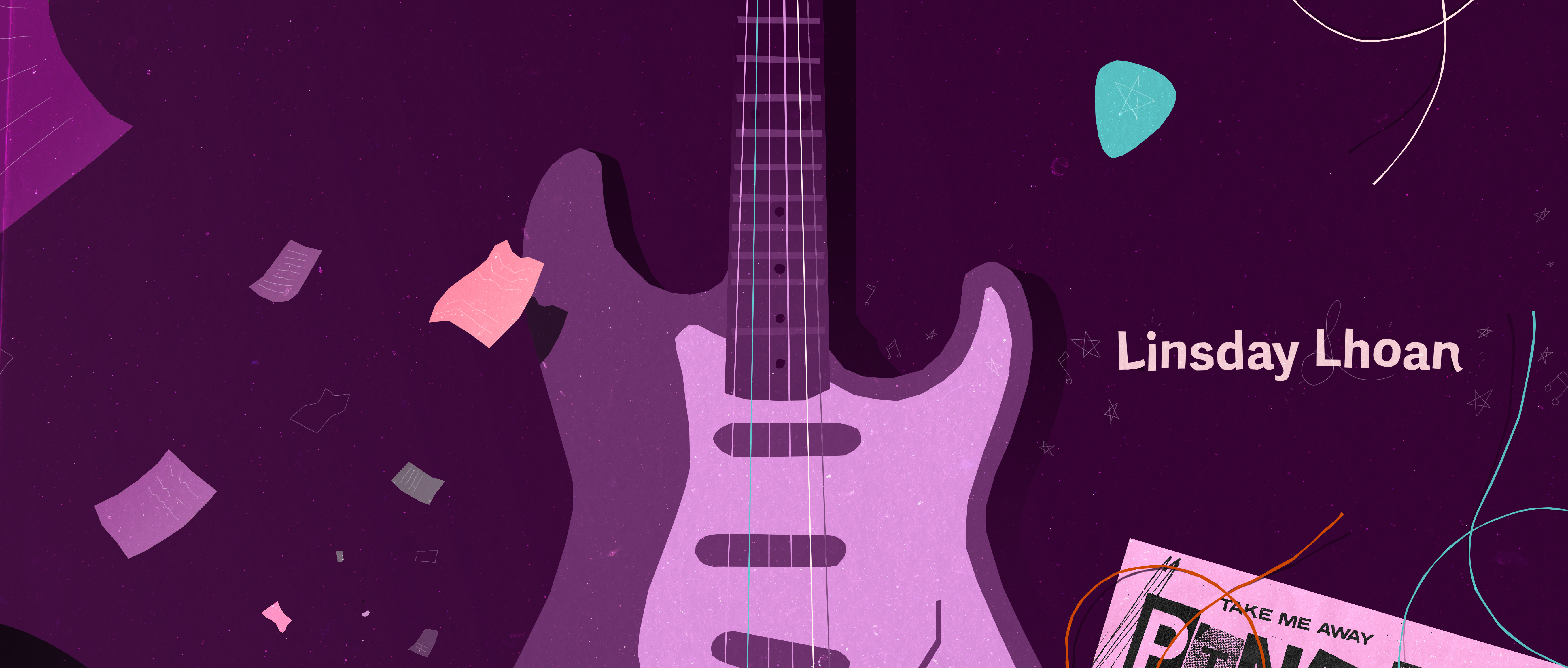
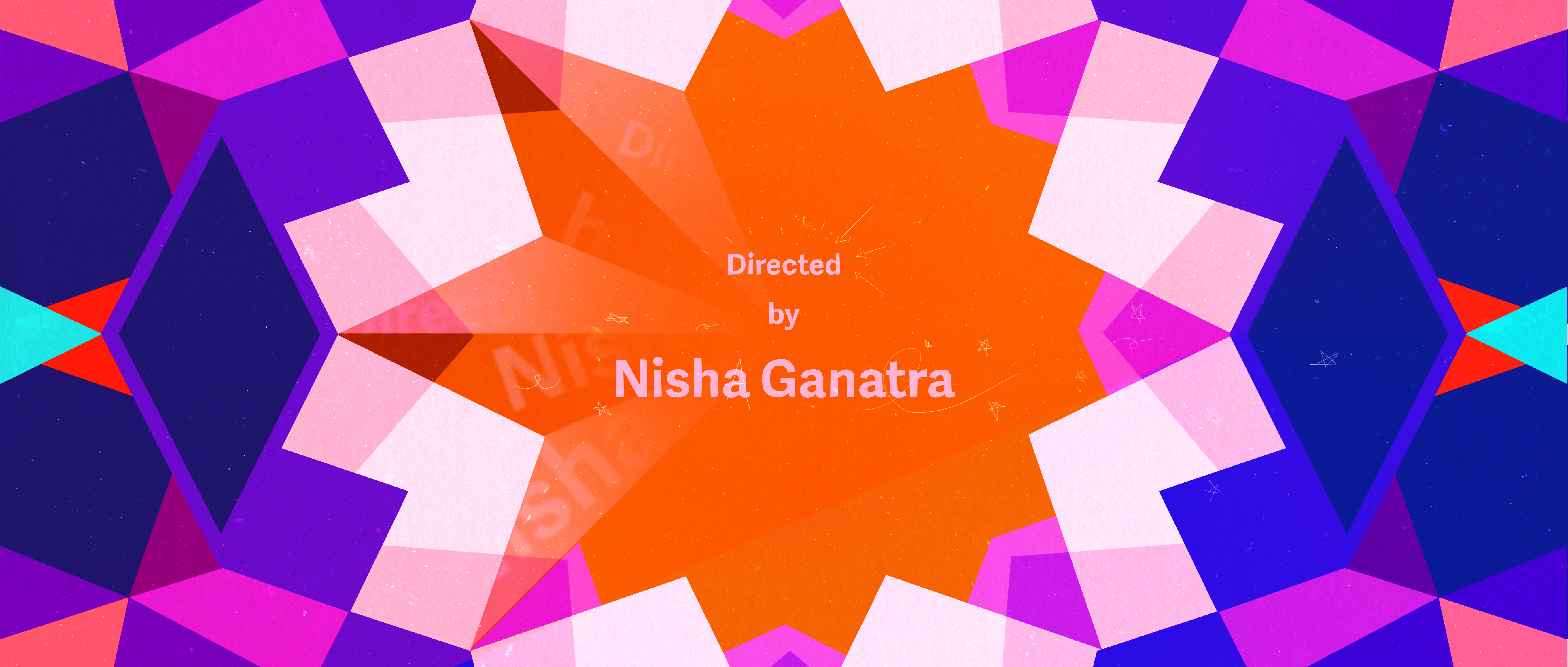
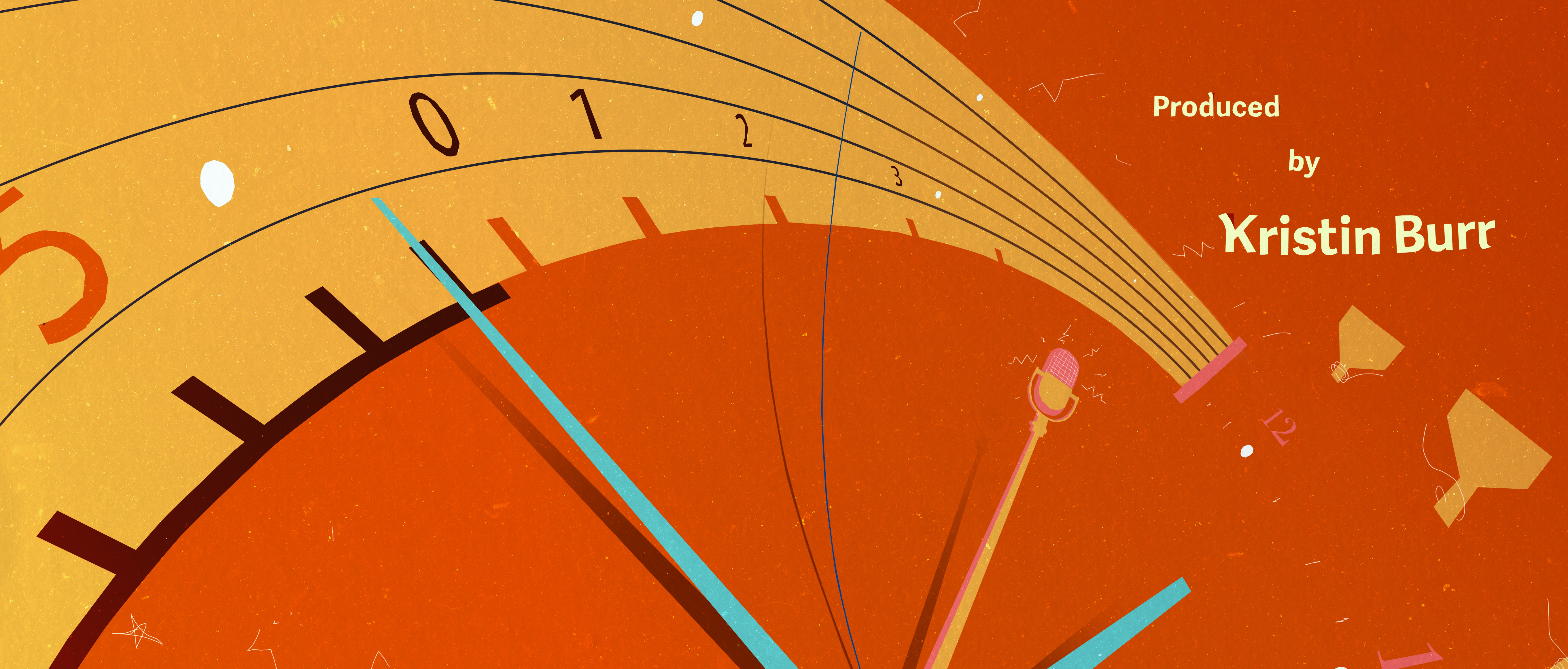
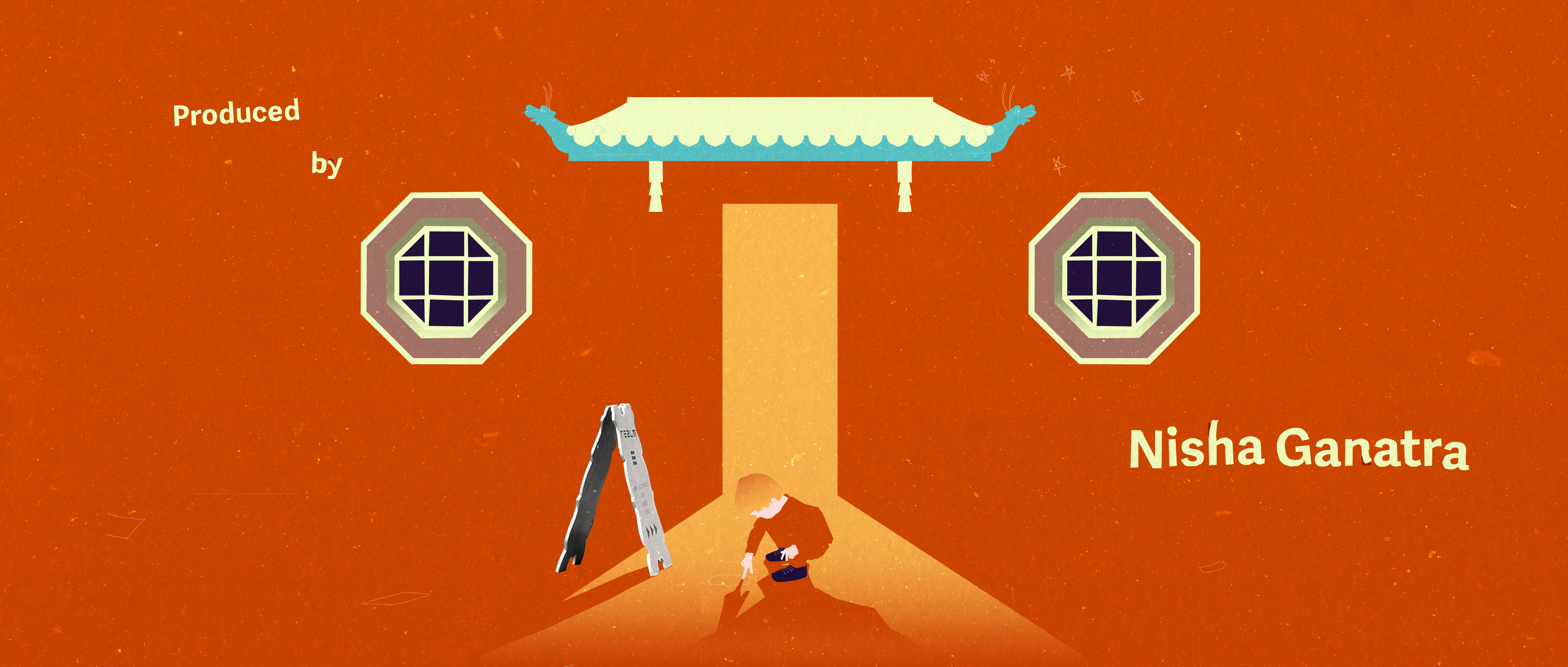
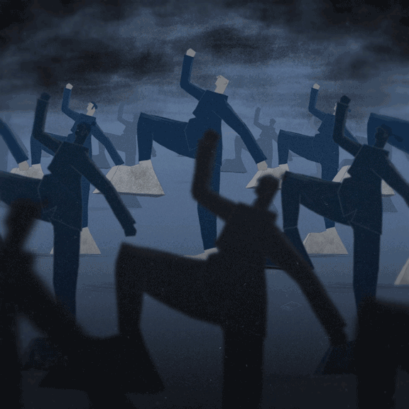
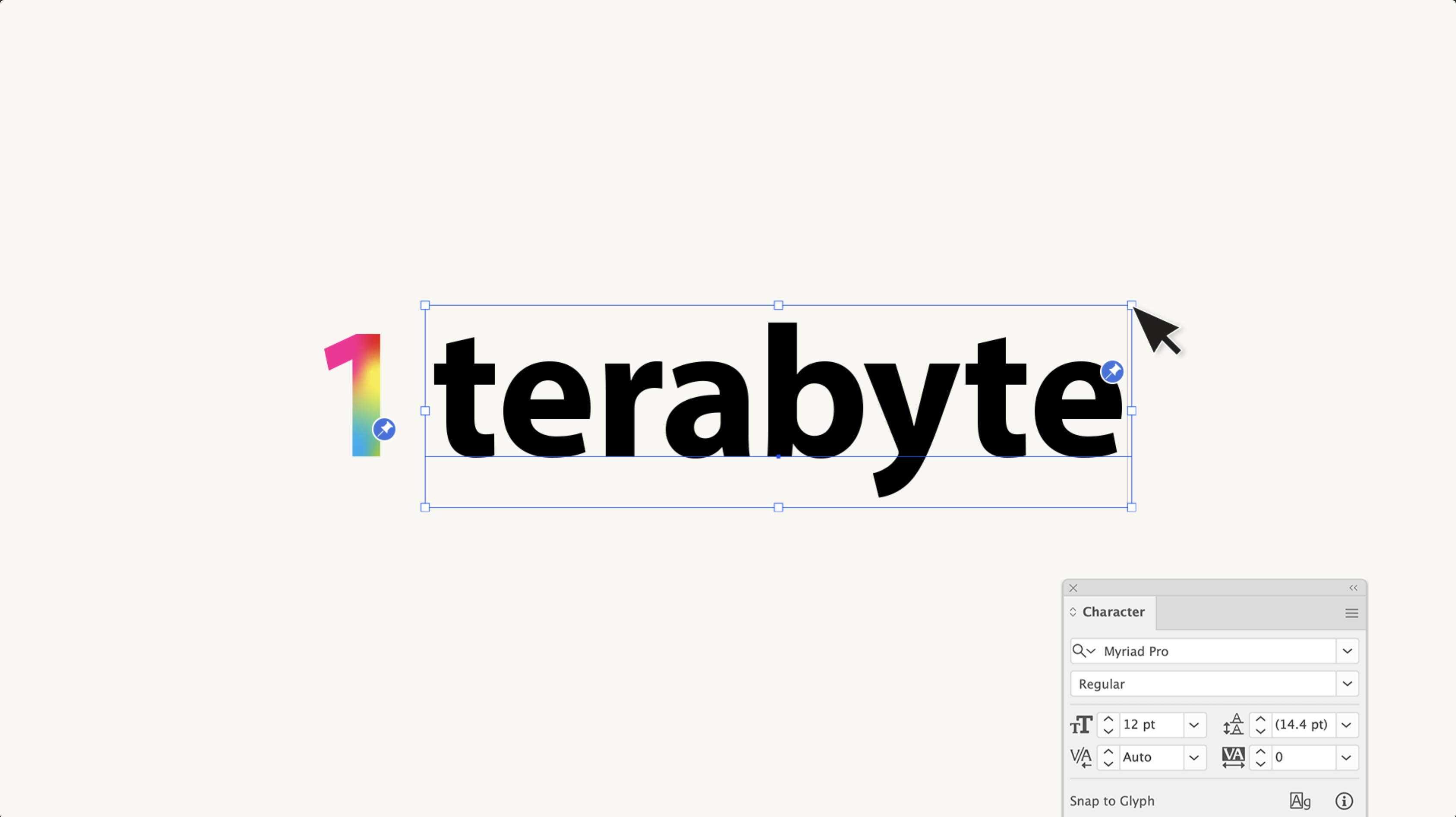
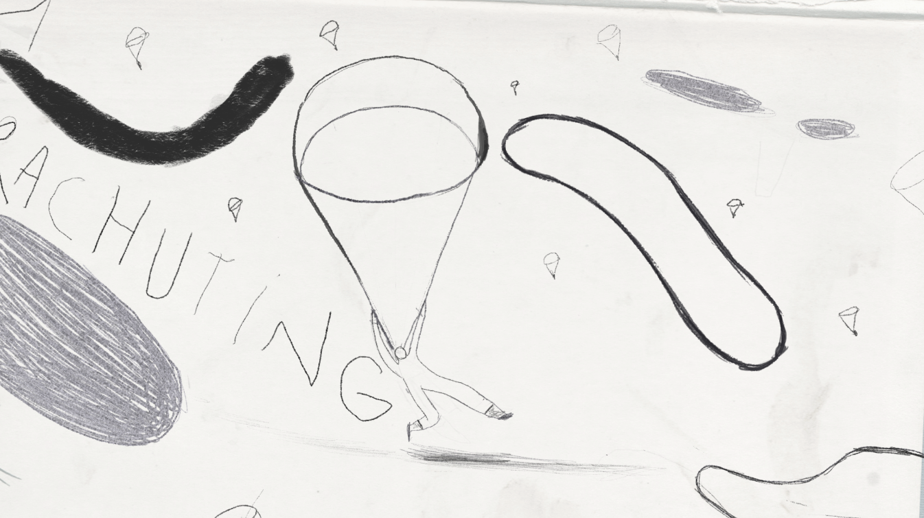
Freakier Friday Titles
Styleframes, AD
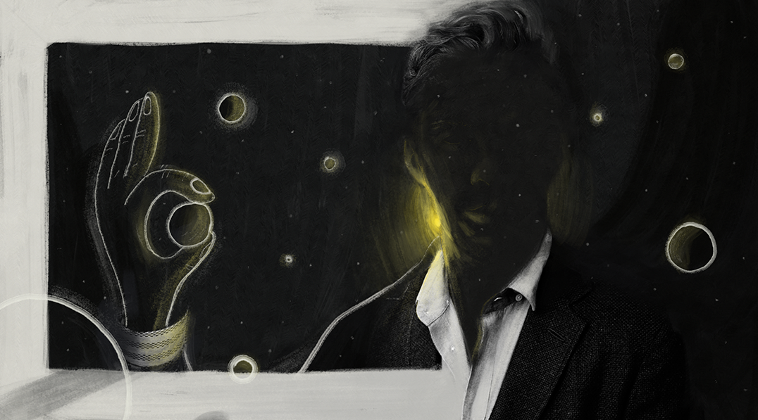
In been brought in by Untold Studios and CD Clarissa Donlevy for pitching on the Disney Freakier Friday main titles. My task was to support the creative director vision and interpret visually the narrative she was creating for the intro of the film.
The idea was to take some elements from the original titles and try to recreate a more modern language able to tell the story between the two different films; Freaky Friday from 2003 and the new Freakier Friday, 2025.
My idea was to craft an illustrated minimal style mixed with some collage elements and simple typography in order to have a more symbolic narrative associated with the actors names, dynamic transitions and digital time-lapse would help the story moving through the years till a final integration with the movie in order to start the actual new story.

Next project: Vivobarefoot Manifesto
︎︎︎
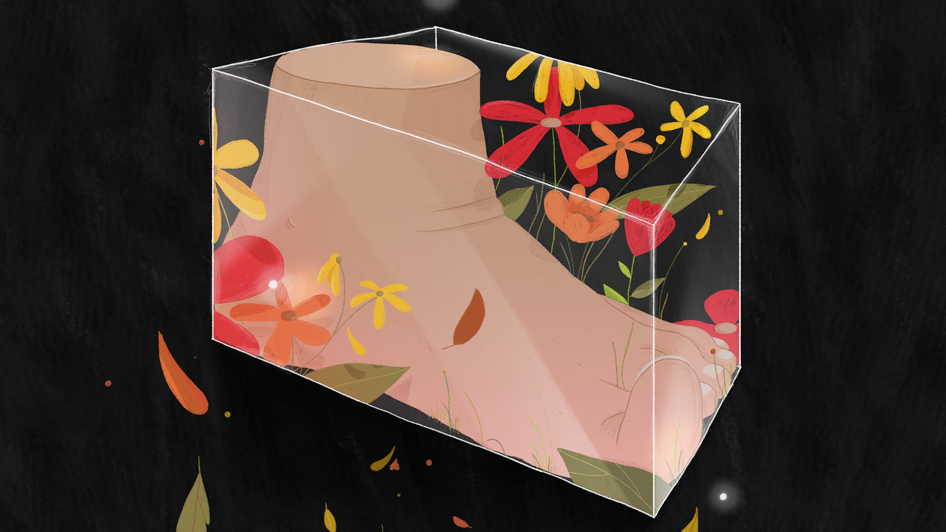
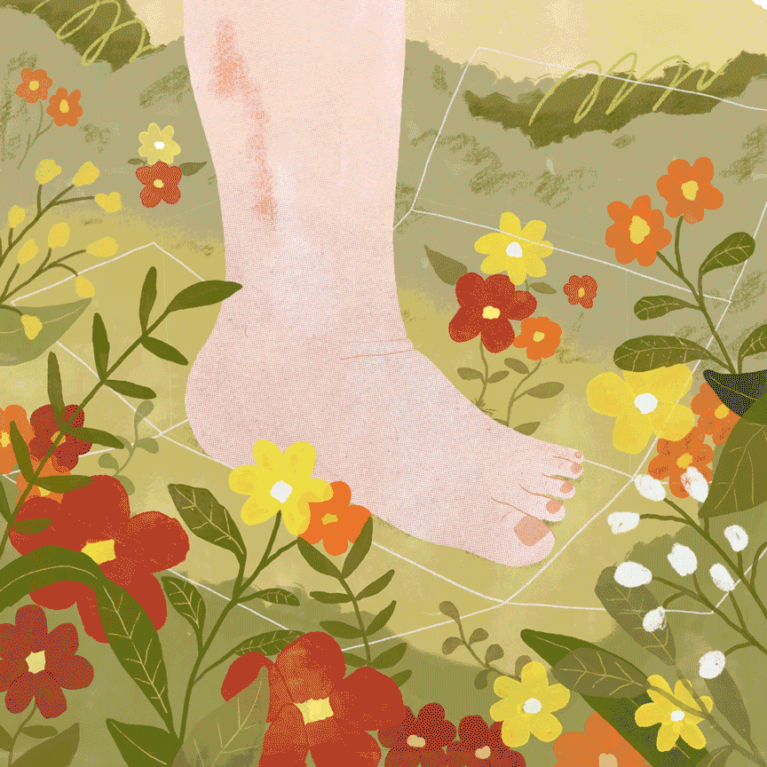
Vivobarefoot Manifesto
Styleframes, Animation
The Vivobarefoot manifesto was a complex mixed media project developed at Nerdo. Due to the nature of the project, which you can see at the following link: https://www.youtube.com/watch?v=ijFmjbYrfAY the team was pretty multifaceted.
My roles this time spaced from art to animation to helping the director having an external point of view on the video rhythm and emotional narrative. Here below you can see the art and animation tests I’ve done for the shots I’ve got assigned. During the project I was free to explore different possibilities for my own shots, but always keeping in mind the previews (as you can see in the foot to shoe animation clip) and the next one due to how the different clips were interwoven.
The animation, for my clips, was a mix of digital and traditional techniques finally hand painted on dedicated softwares.
Next project: Beião Museum
︎︎︎
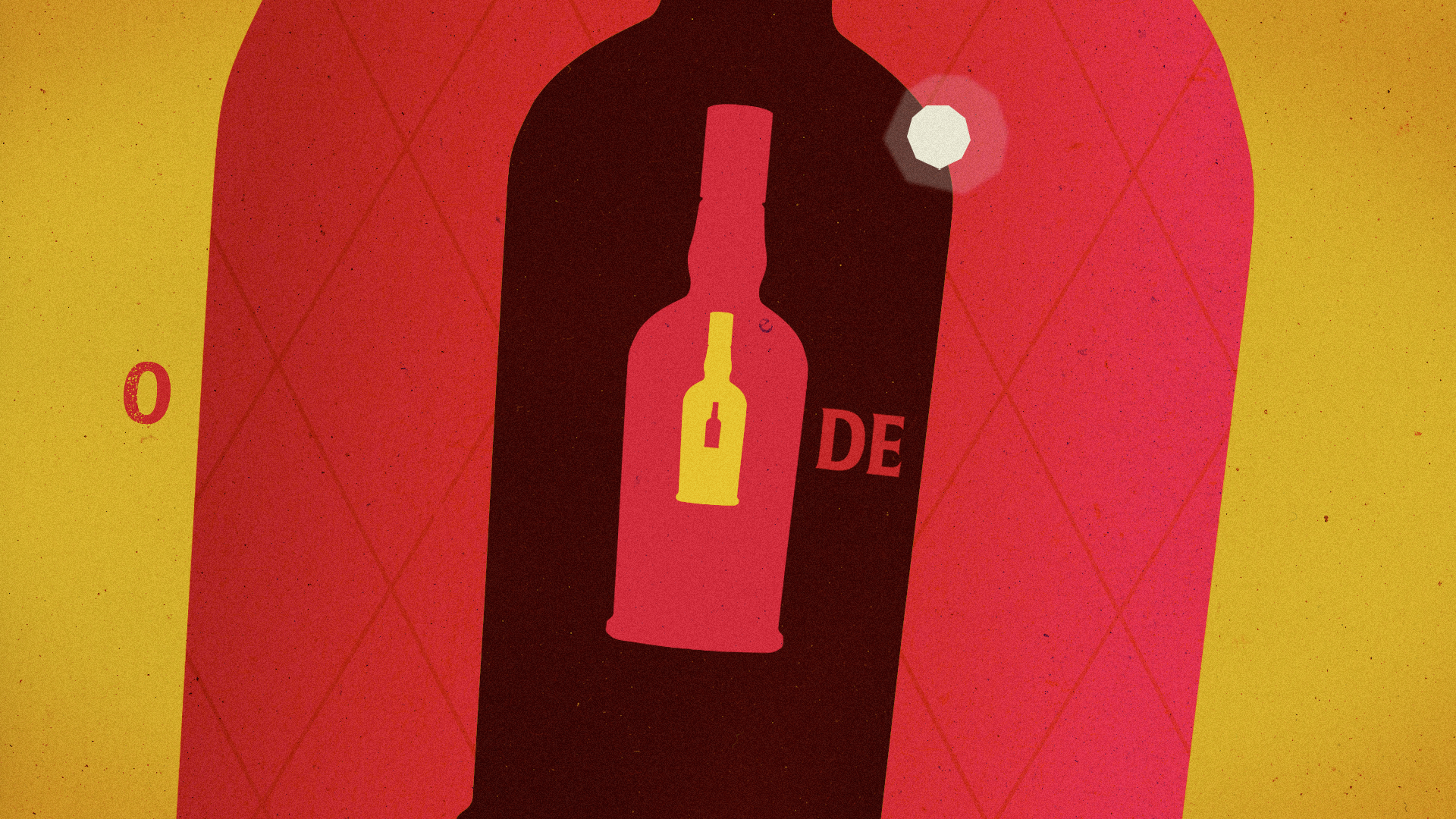
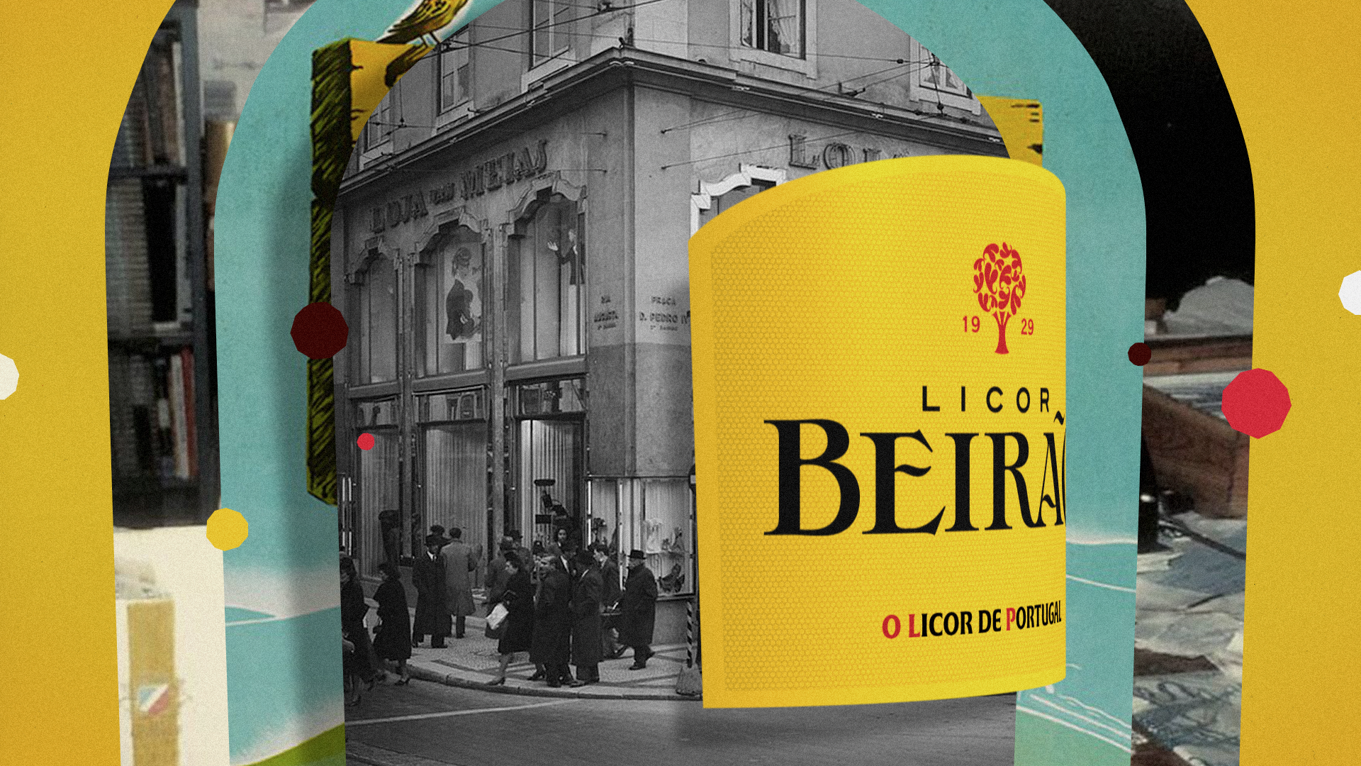
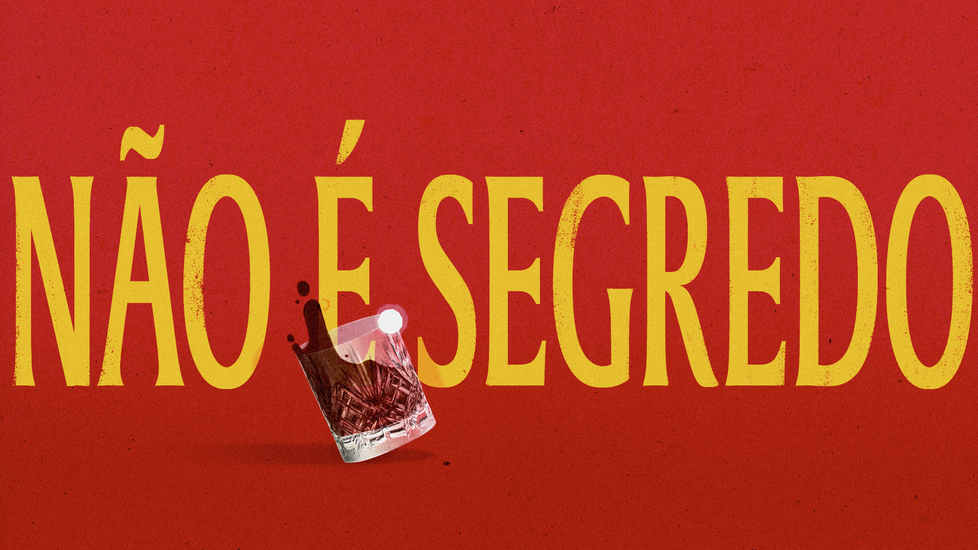
Beirão Museum
Creative direction, Art direction, Styleframes
Script and concept boards for Museo Beiraõ, the prestigious liquor of Portugal. My task was to create an engaging visual story able to tell the origin story of Liquor Beirão, its past and envisioned brand future. Everything mixing a playful narrative with real archive footage from the Liquor Beirão Museum, historical pictures of Portugal and a wide use of typography.
The original concept I proposed spinned around the: “It’s not a secret” phrase. This, would have worked as opening sentence to introduce every chapter of the liquor history till getting to what is actually a secret; the formula of the liquor (without revealing it) which get passed down generation by generation.
Closing on the point that some stories need to be told while others is better remain a secret.
The script concept was accompanied by a set of 6 concept boards that you can see here.


Next project: FMDA
︎︎︎
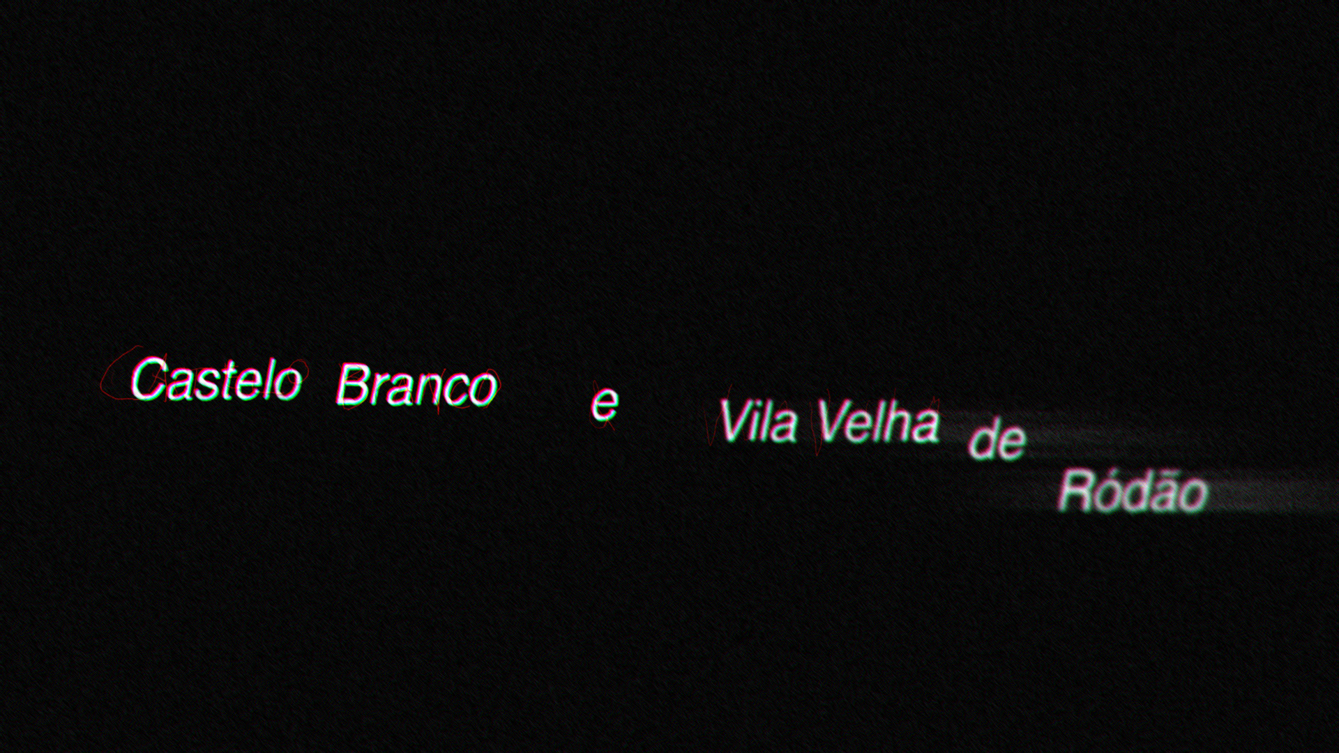
FMDA
Creative direction, Art direction, Styleframes
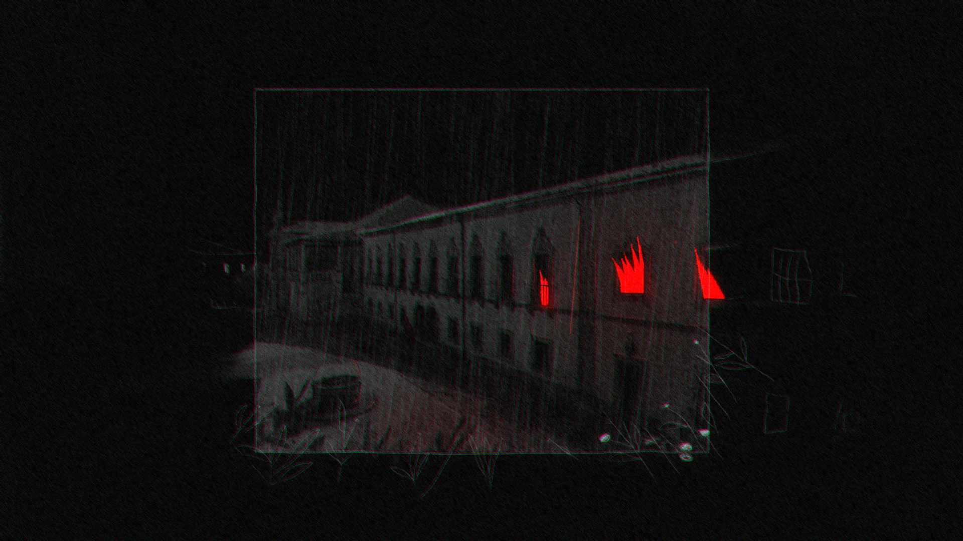
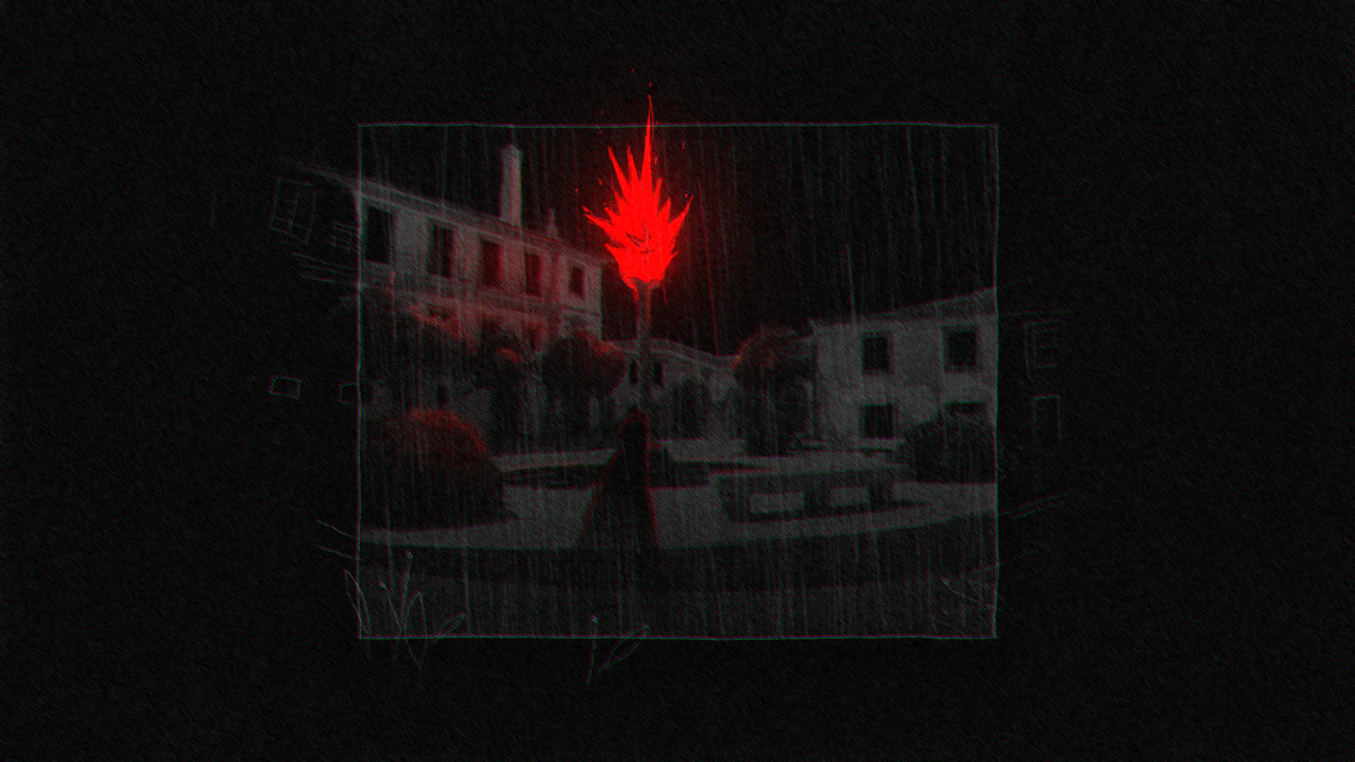
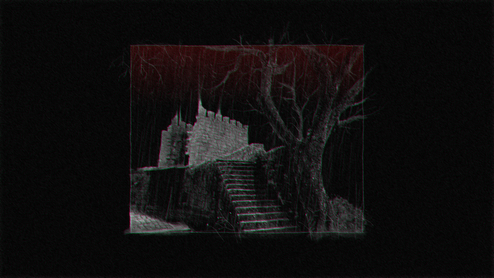
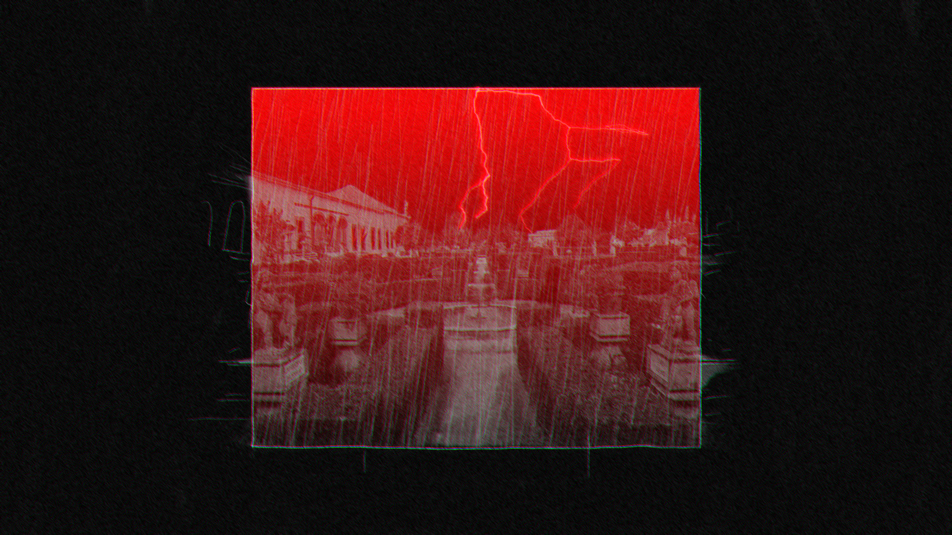
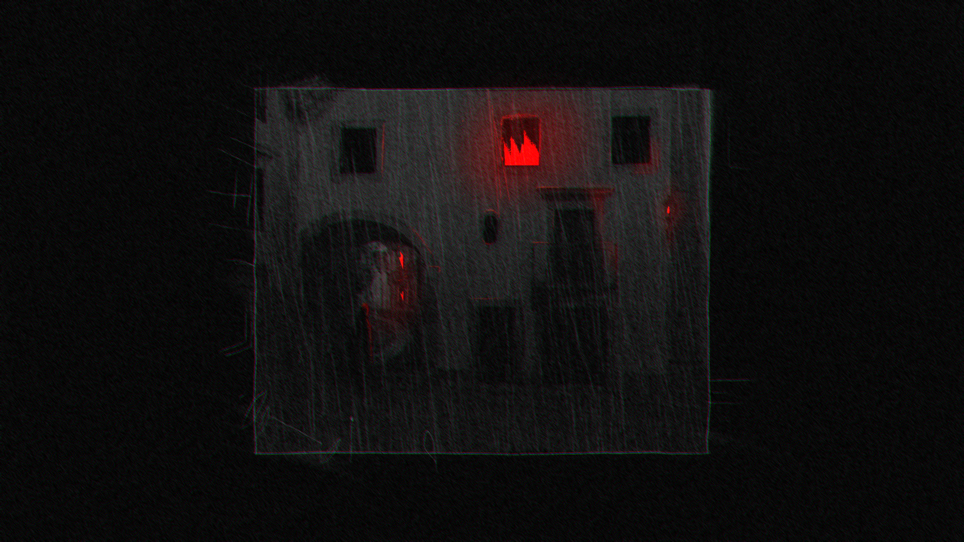
First spot ever created for Casa da Animaçao - FMDA.
The main idea was to clean from any modern aspect the locations where FMDA will be held, bringing back the old Portuguese architecture, surrounding hit with a cover or horror and mistery.
The result is a 30 sec 2d mixed media project able to combine real locations and traditional animation into a unique dark bi-chromatic aesthetic.

Next Project: The Residence
︎︎︎

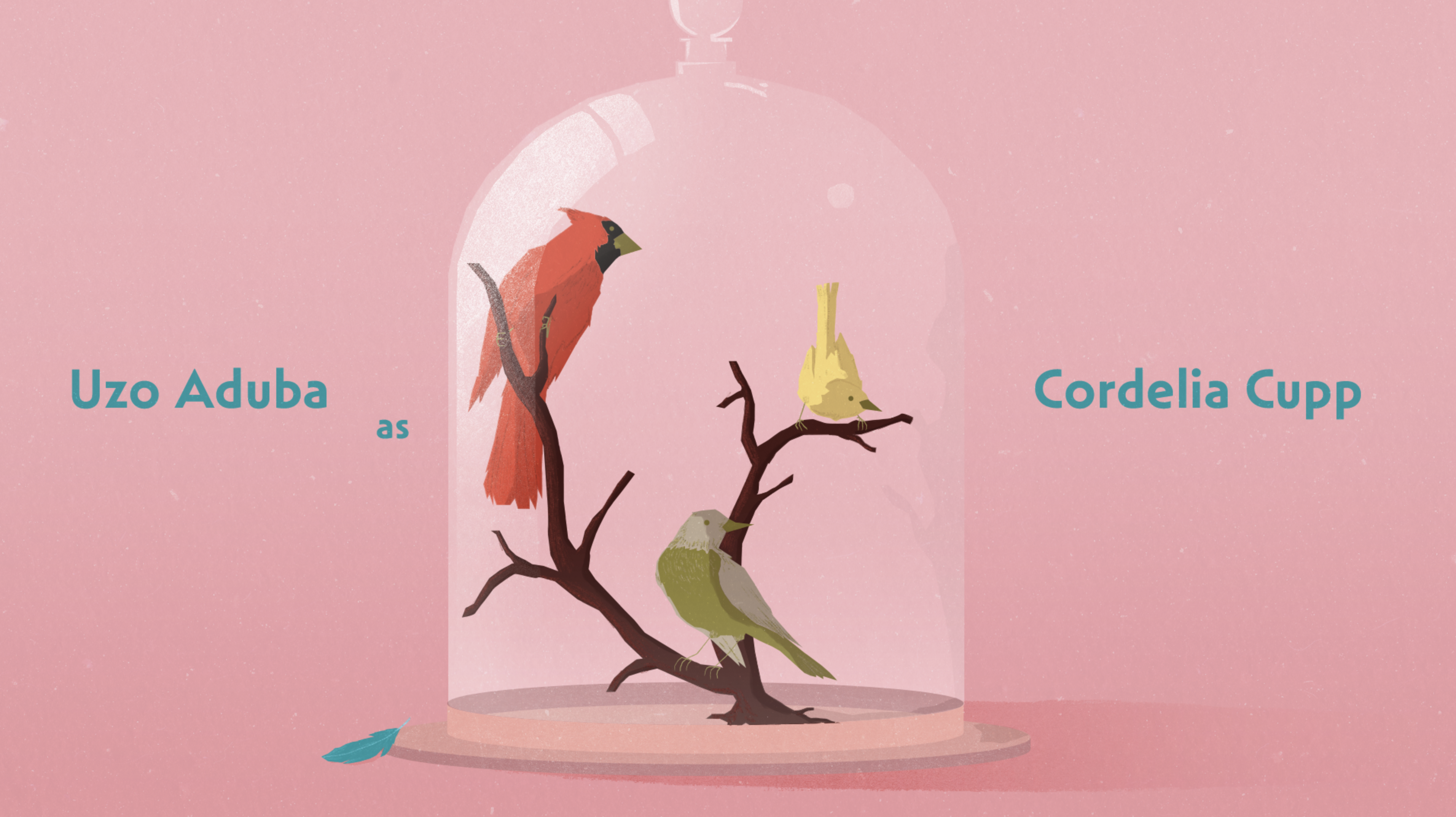
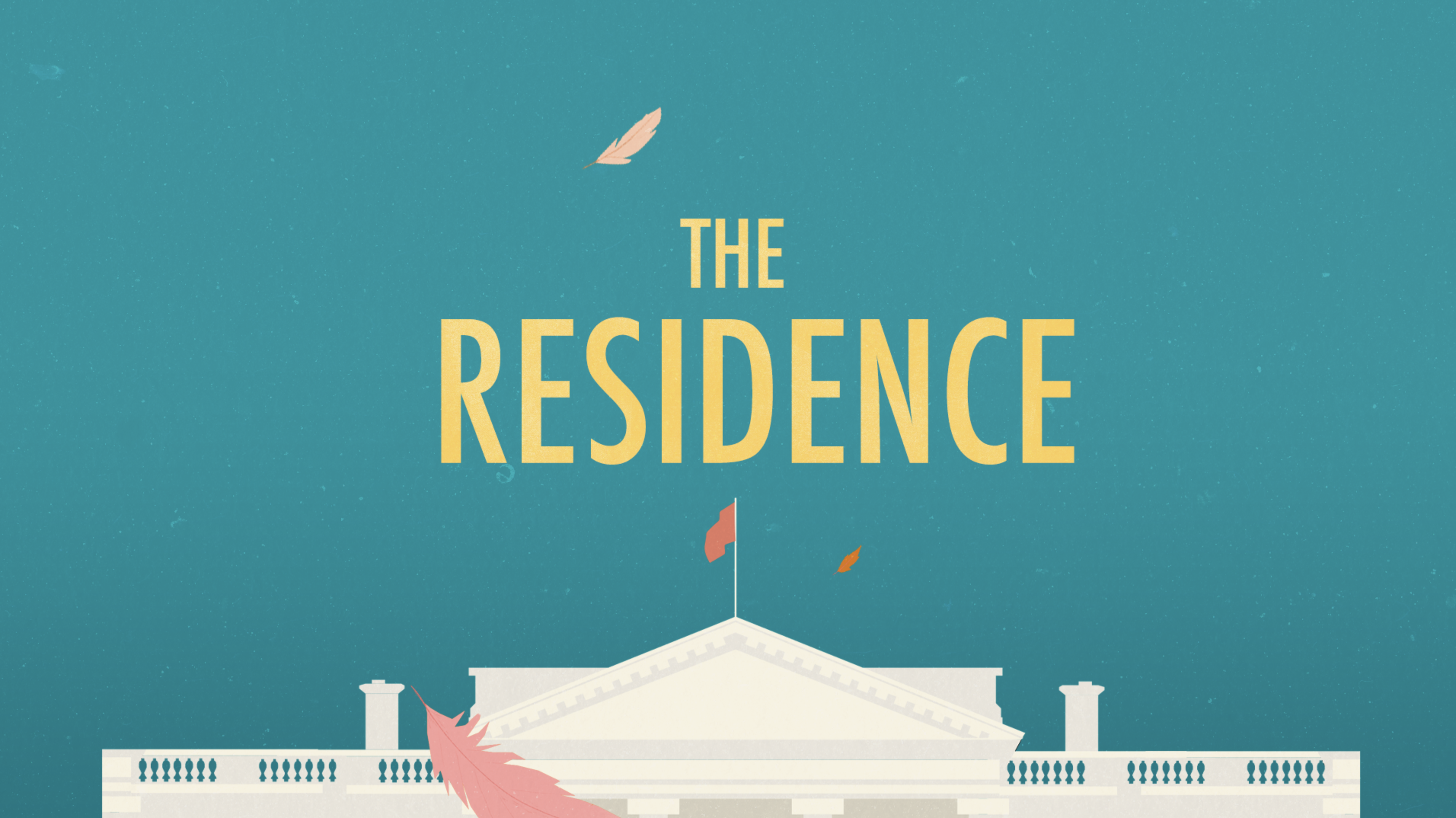
The Residence
Styleframes and Art Direction
Developed for Sarofsky X Netflix
This set of boards is my proposal for the Sarofsky pitch for “The Residence”, a dark comedy involving a murder case, a detective, and her obsession with birds.
My 2D approach focused on “still life” and “interrupted moments”. With a strong focus on details and specific objects present in the series, I wanted to hint at the presence of someone or something without revealing anything from the plot, engaging the audience with colourful scenes able to blend dreamlike elements with more grounded moments from the show.
If you want to read more about the project, visit the Styleframes Case Studies page.

Next Project: Spotify For Artists
︎︎︎
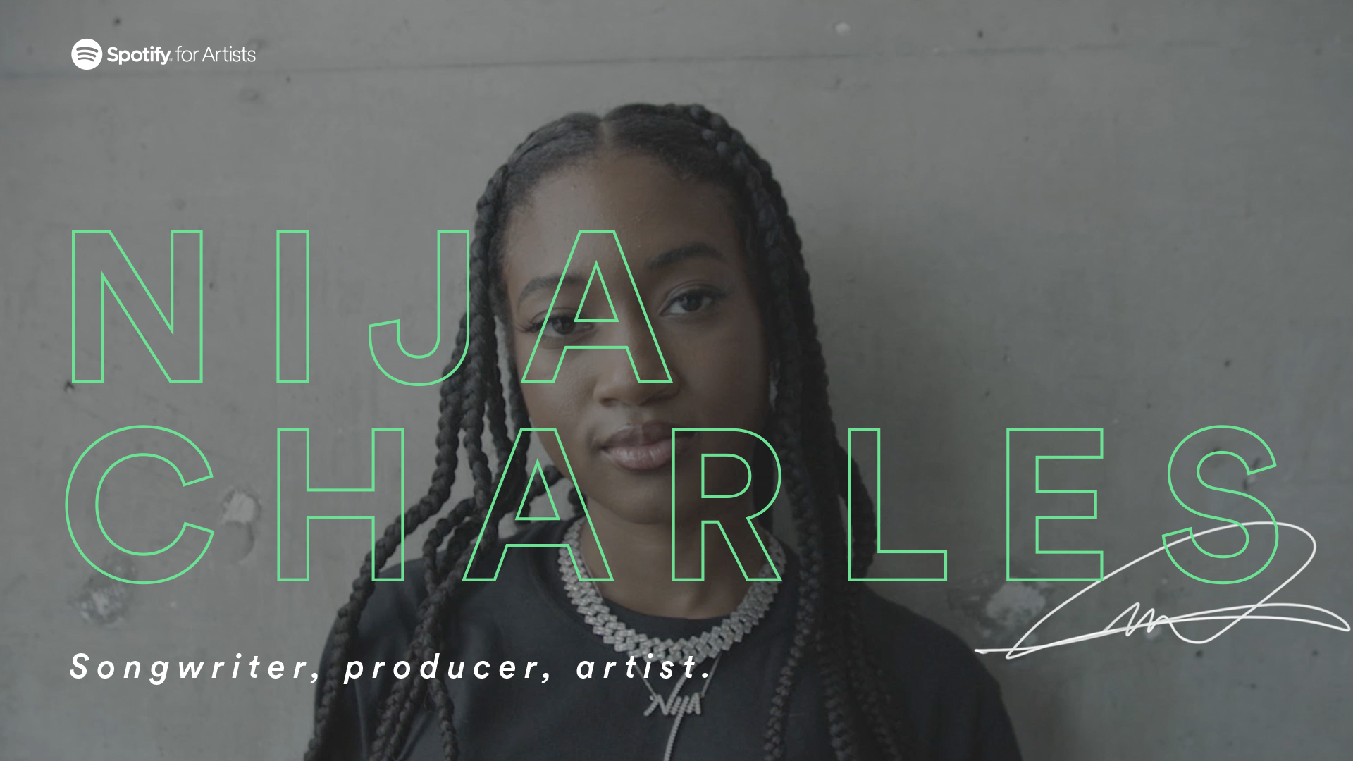
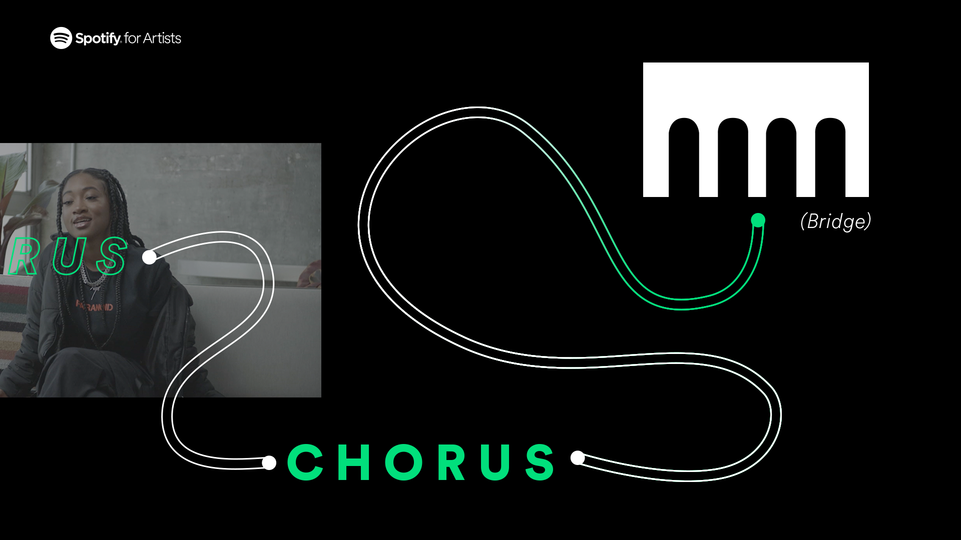
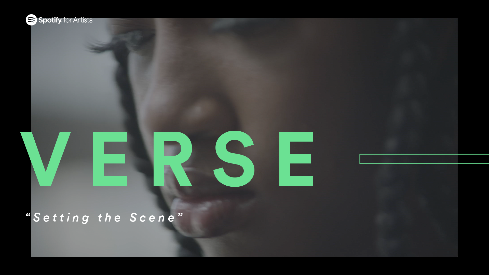
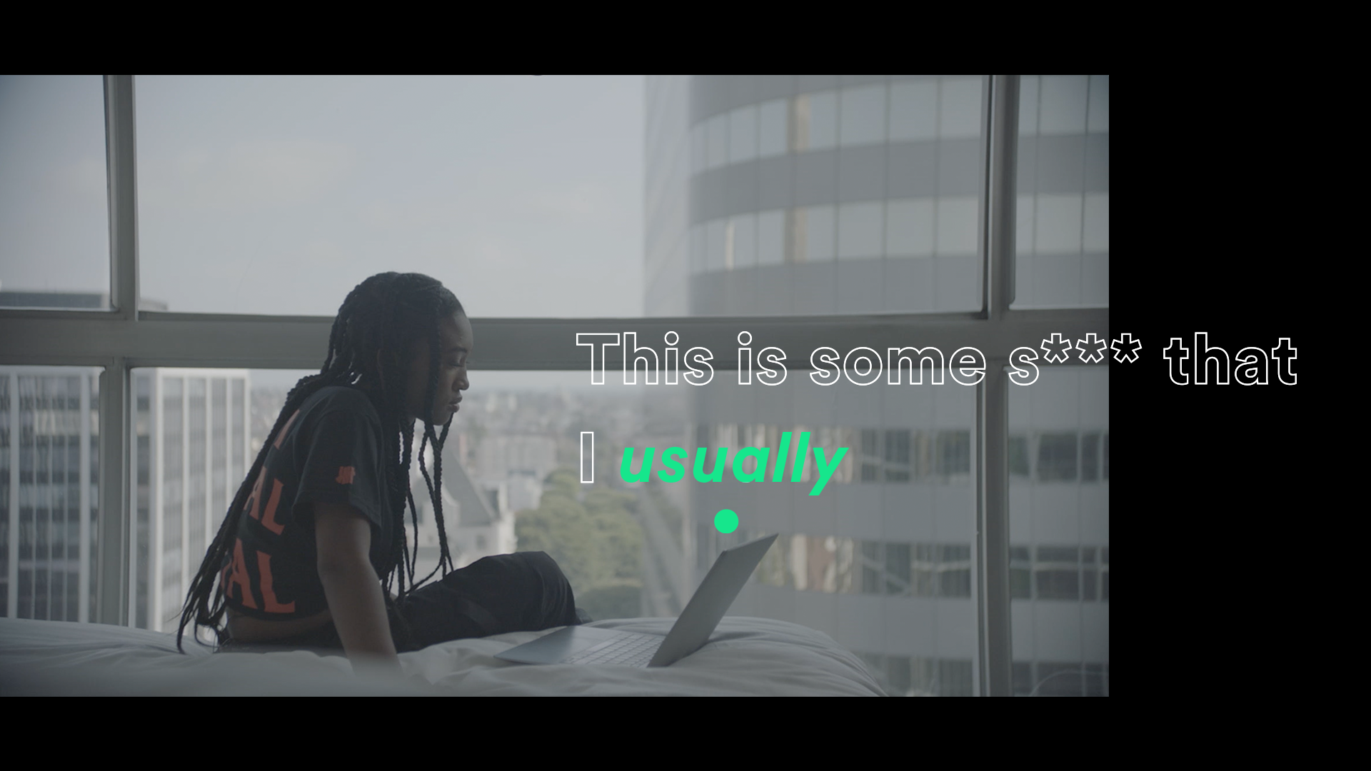
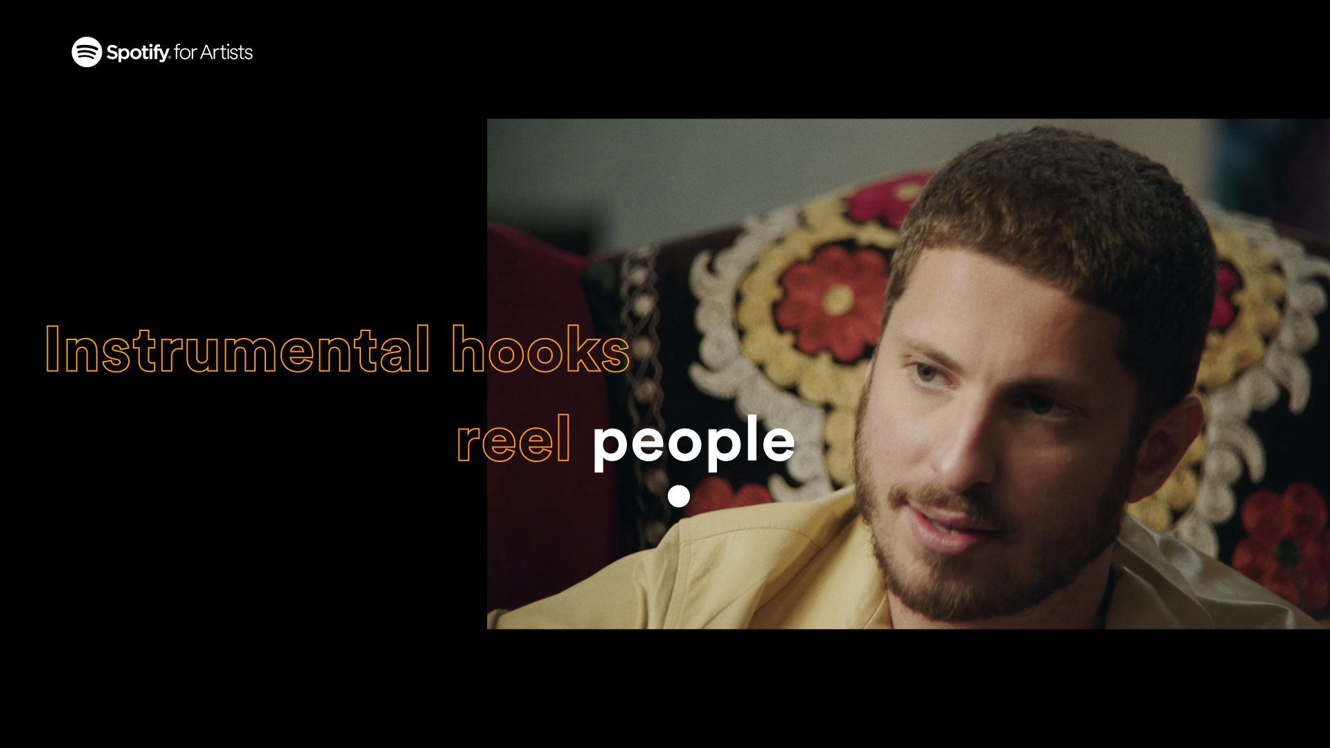
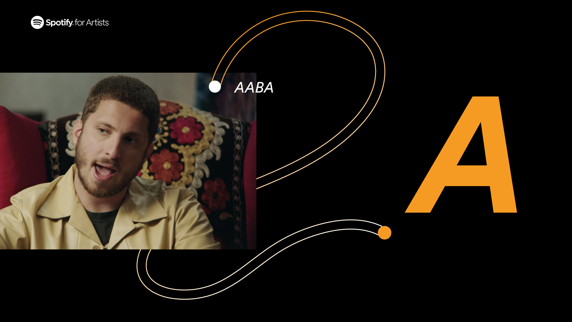
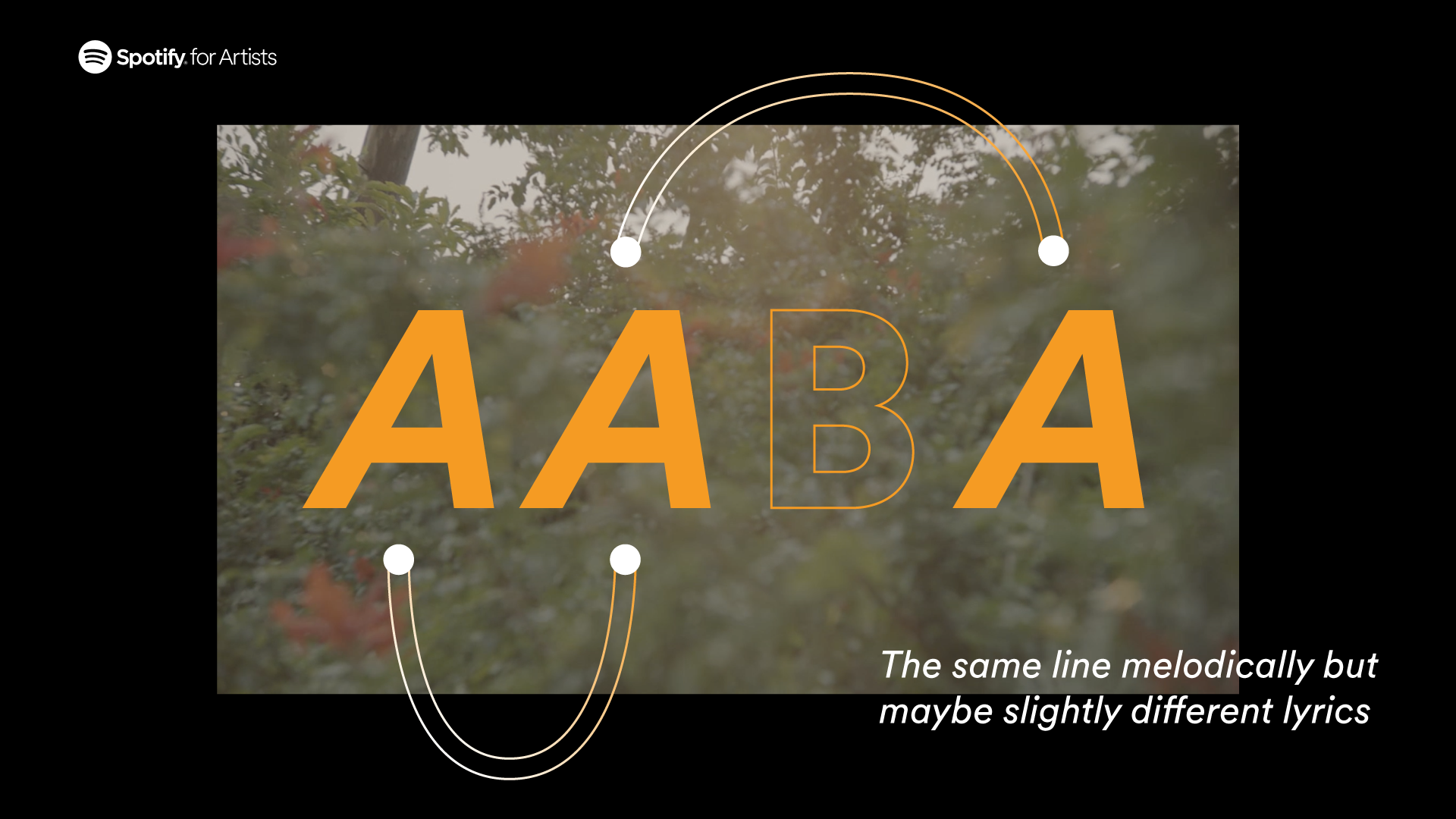
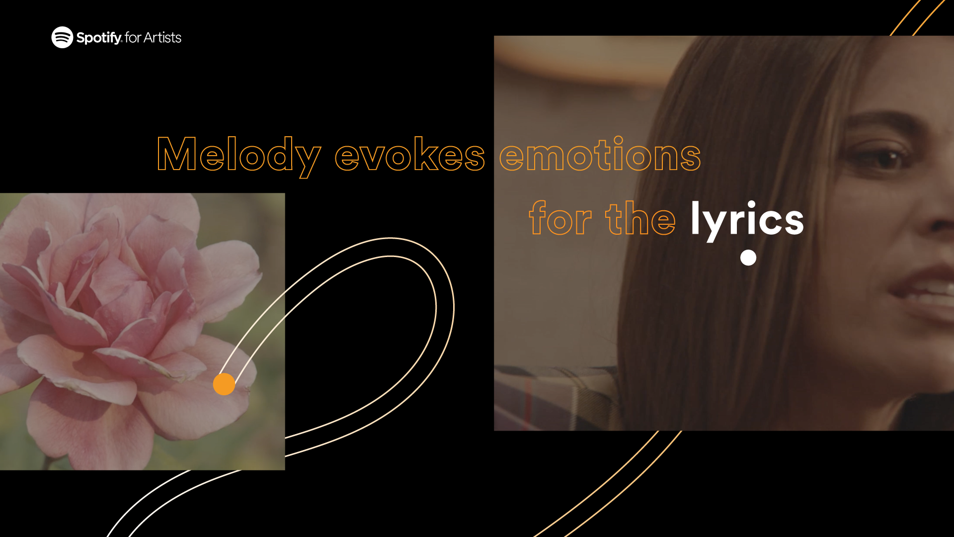
SPOTIFY for Artists
10 Episodes Art Direction for Spotify.
Developed for Partizan.
For this Spotify project I ve got asked to work as external Art Director. My task was thinking and developing the graphic and animation style for a 10 episodes series. I helped the client reframing the project proposing the creation of a motion graphic system that would work similarly to a tv brand identity system, so scalable, and easy to use through all the episodes.
During production I ve got to implement the system deconstructing lyrics videos, charts or simple bullet point lists and redesigning them in order to seamlessly adapt to motion and move from “graphic” to live action minimising the amount of editing.

Next Project: Apple
︎︎︎
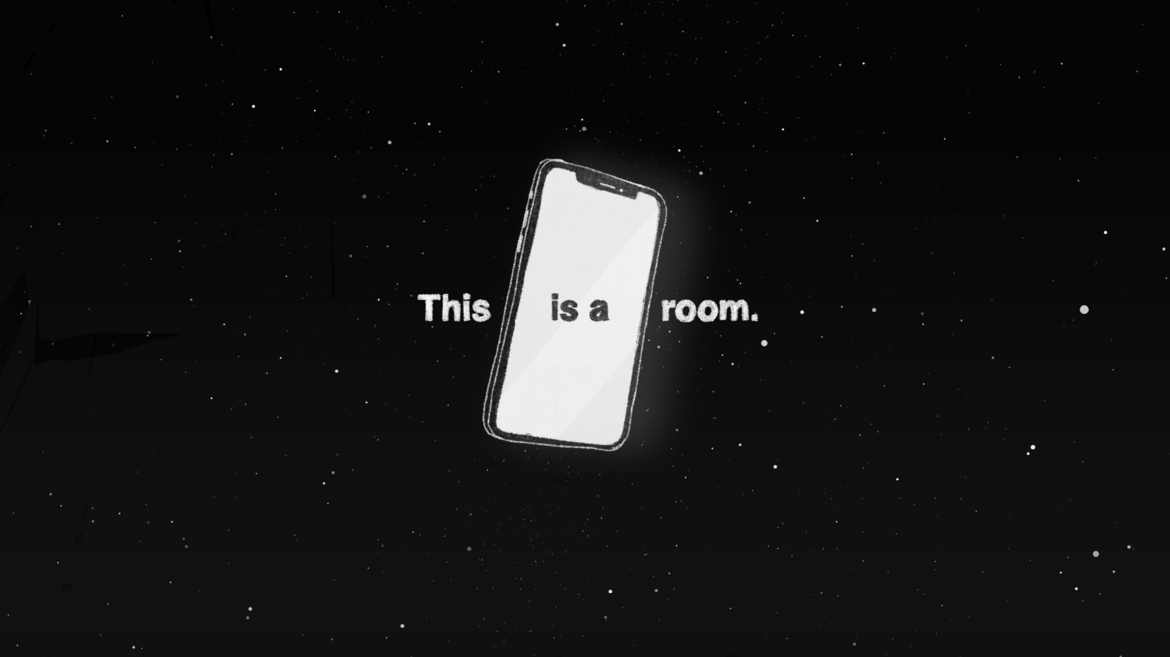
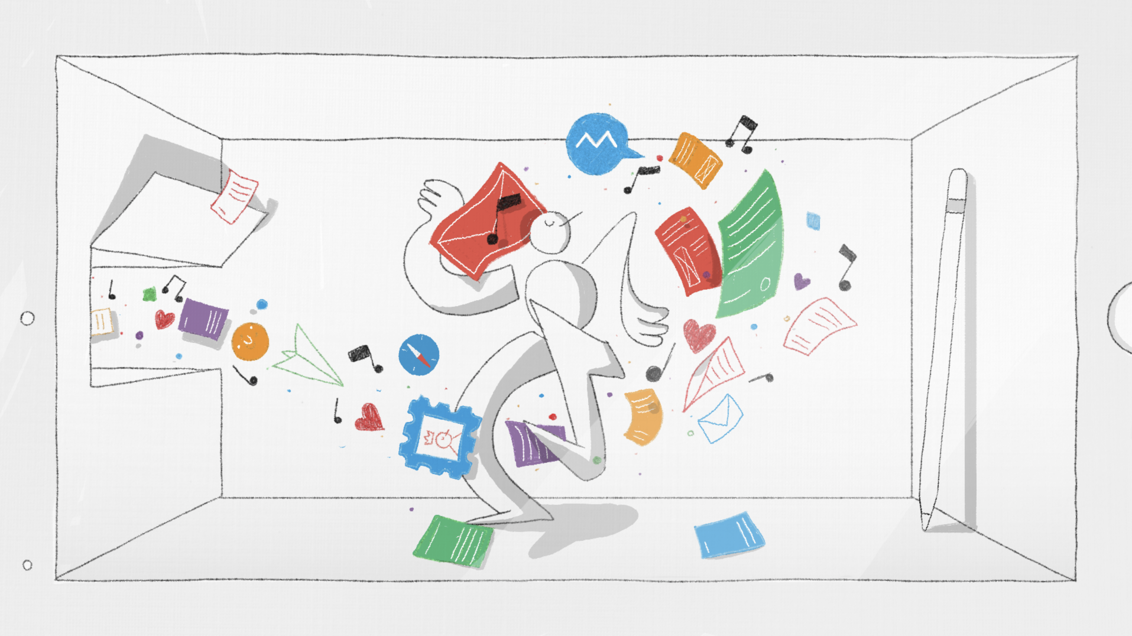
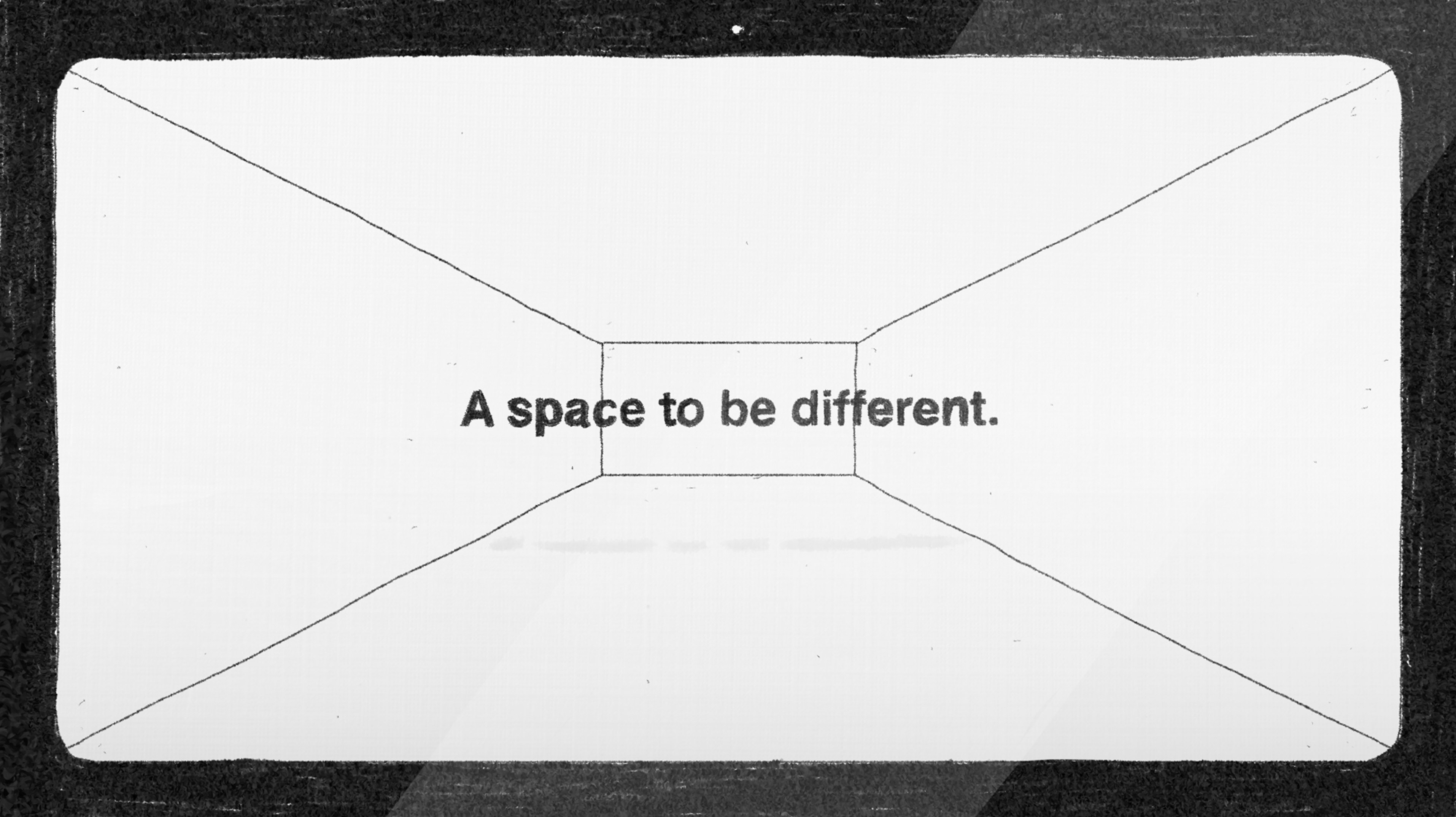
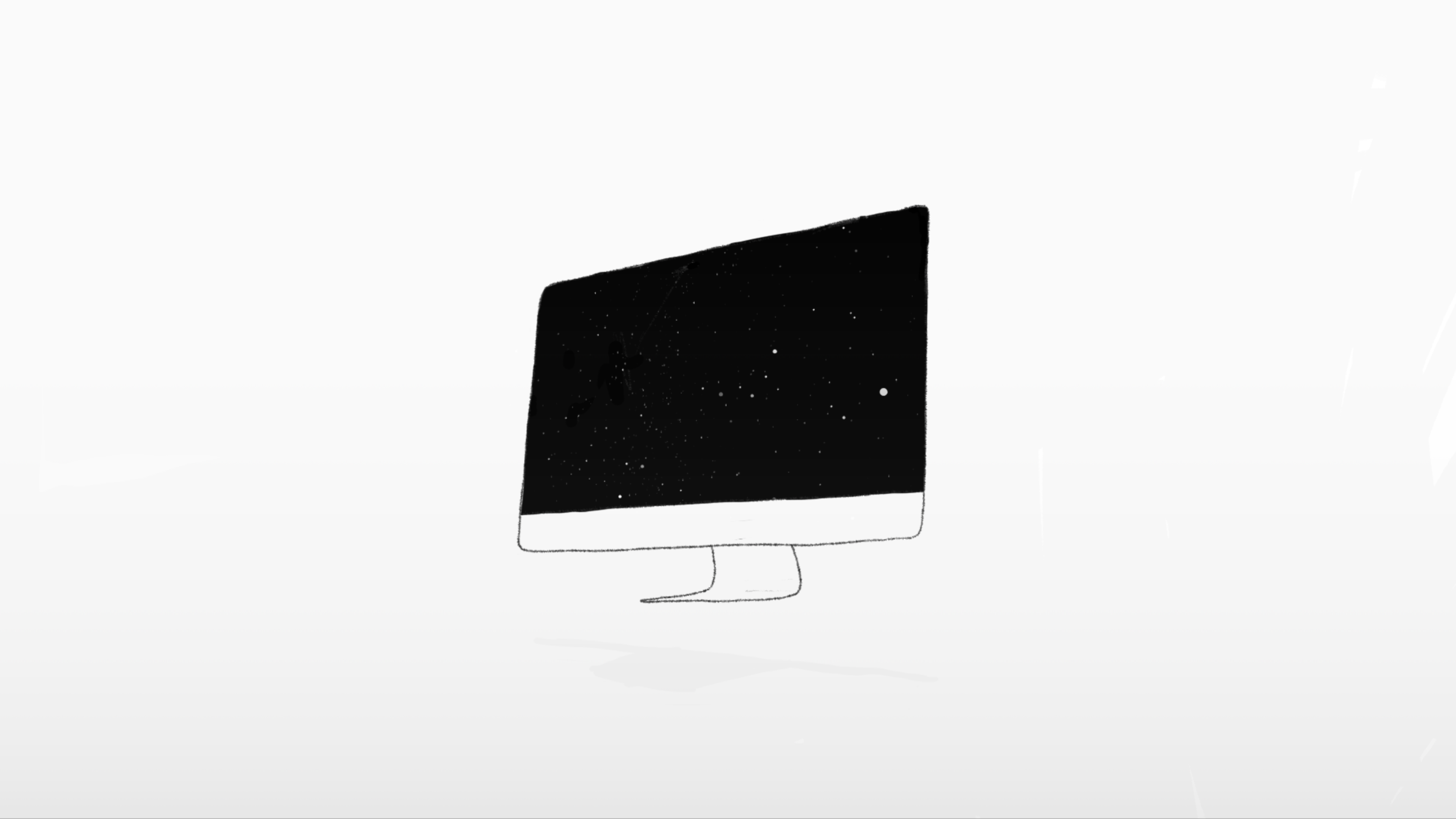
APPLE, a space to be different
Concept boards for Apple short film.
Developed for TBWA / Media Arts Lab and Apple
For this project I ve been asked to develop a narrative and a style for one of the client’s product features. The entire idea was to create a minimal world, able to incorporate both brand guidelines and product in a seamless way even if hand drawn and different from the usual brand aesthetic.
The project was thought to live inside and outside products screens, creating a unique interconnected space between worlds, the one outside and the one inside the devices.
Next Project: Off the Record
︎︎︎

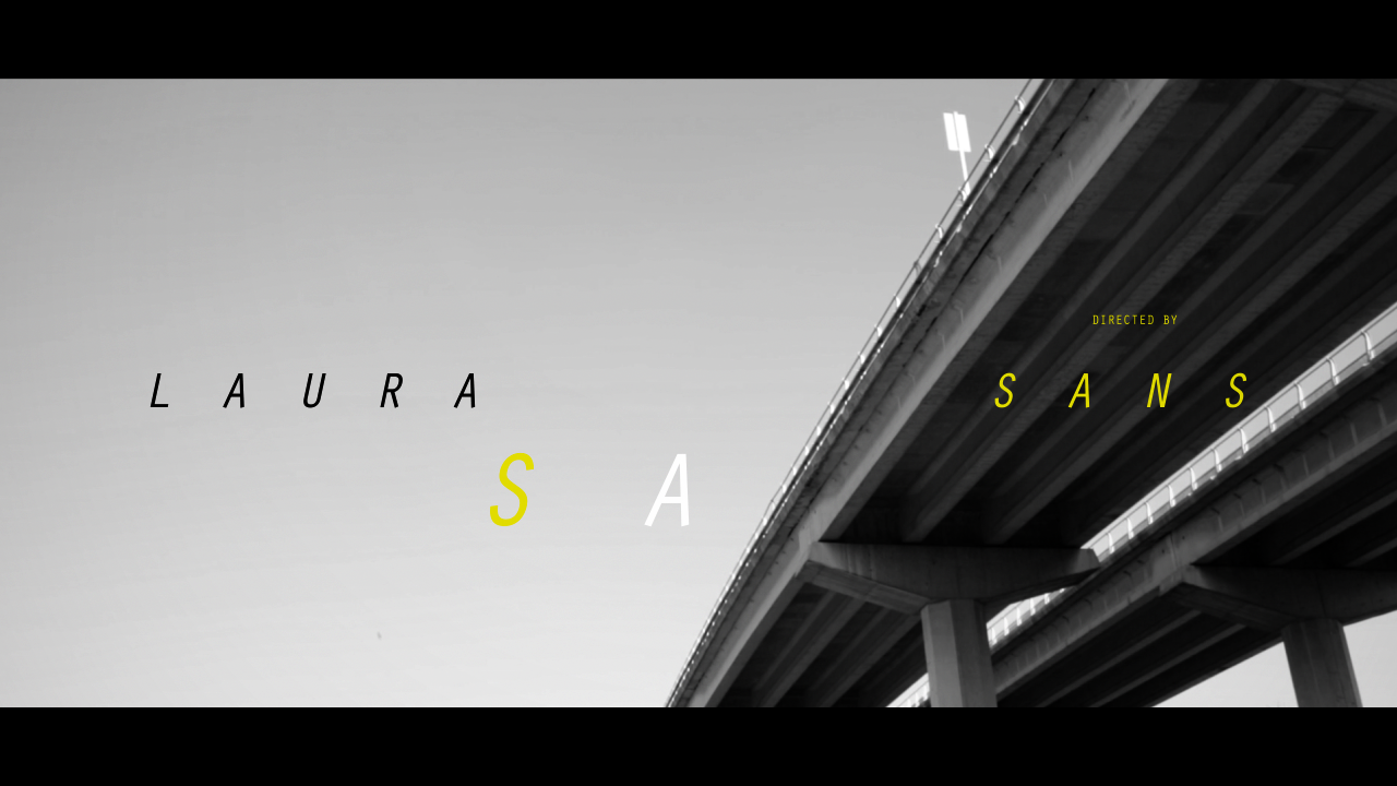
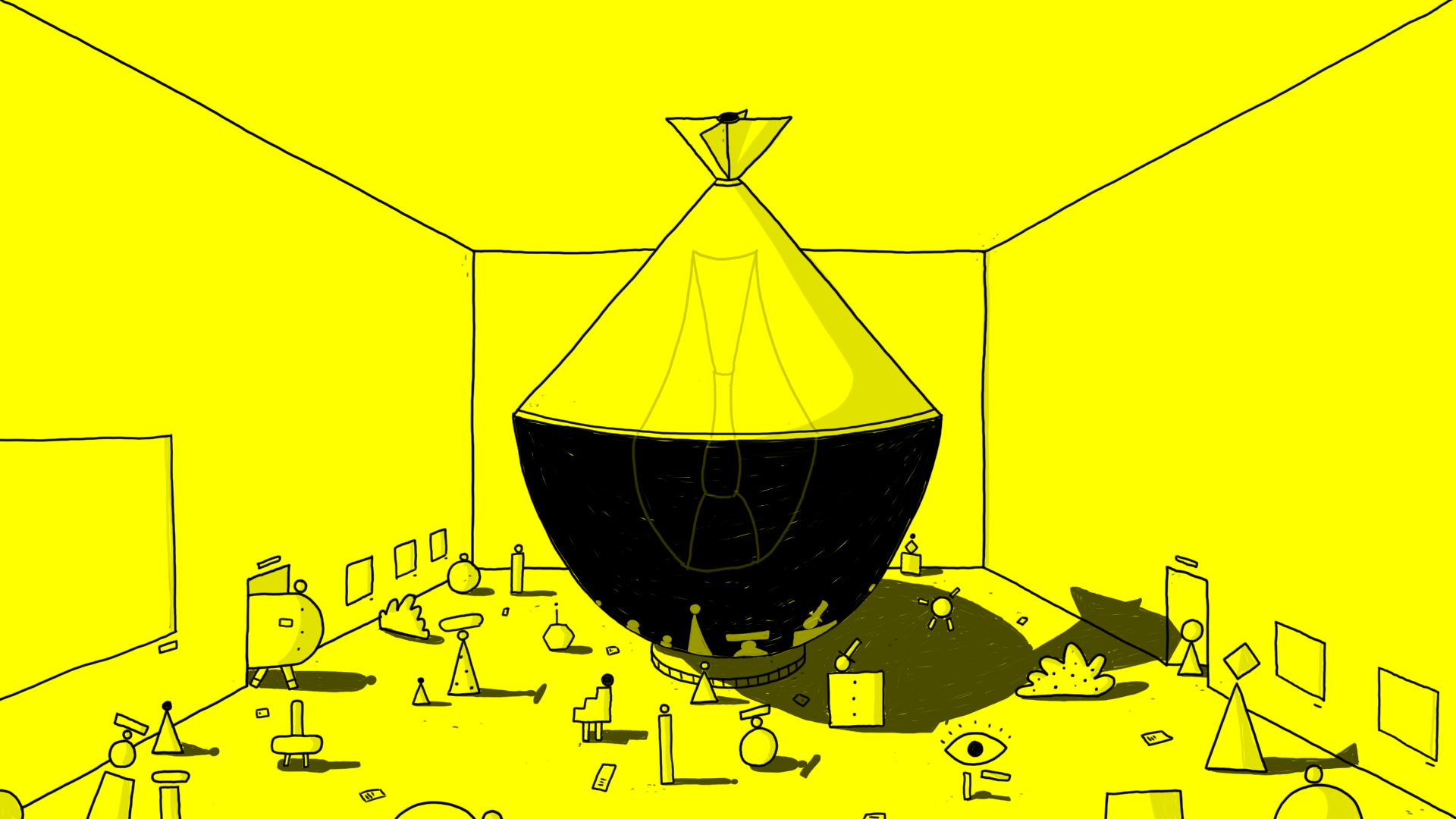
Off the Record
Boards and Art Direction for Feature Documentary graphics
Developed for L. Sans
I was responsible for both the art direction and styleframes for this motion graphics packet for the feature documentary Off the Record. I was tasked with creating a slick typography oriented motion graphics language able to convey both general information, like speakers' names, locations and work attribution titles, and quotes, VOs and a range of other type based assets.
The result was this black, white and yellow visual language able to balance the documentary's visual tone with the production requirements.


Next Project: Dandelion
︎︎︎

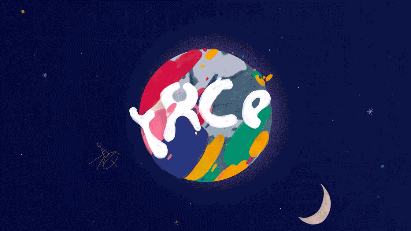
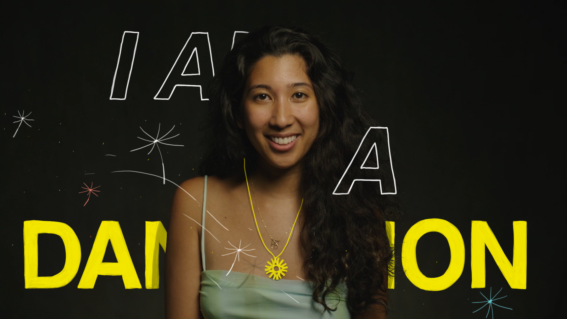
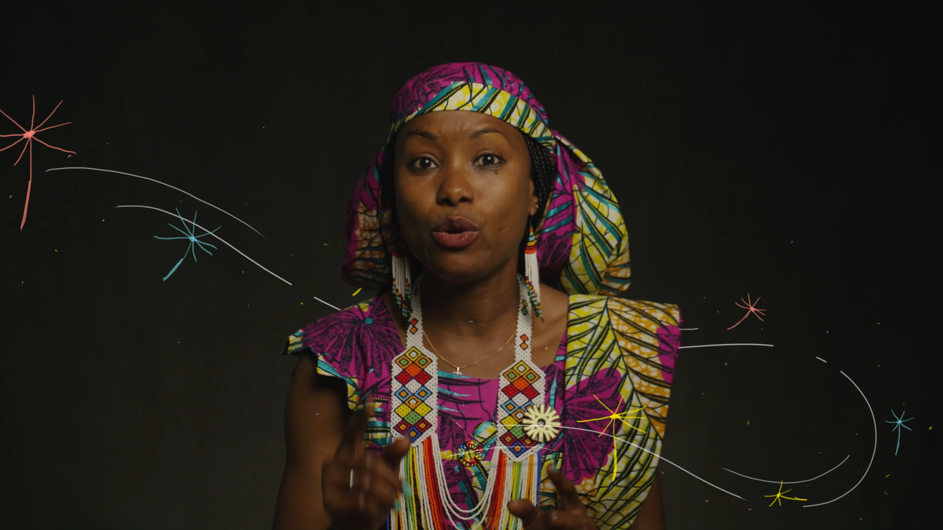
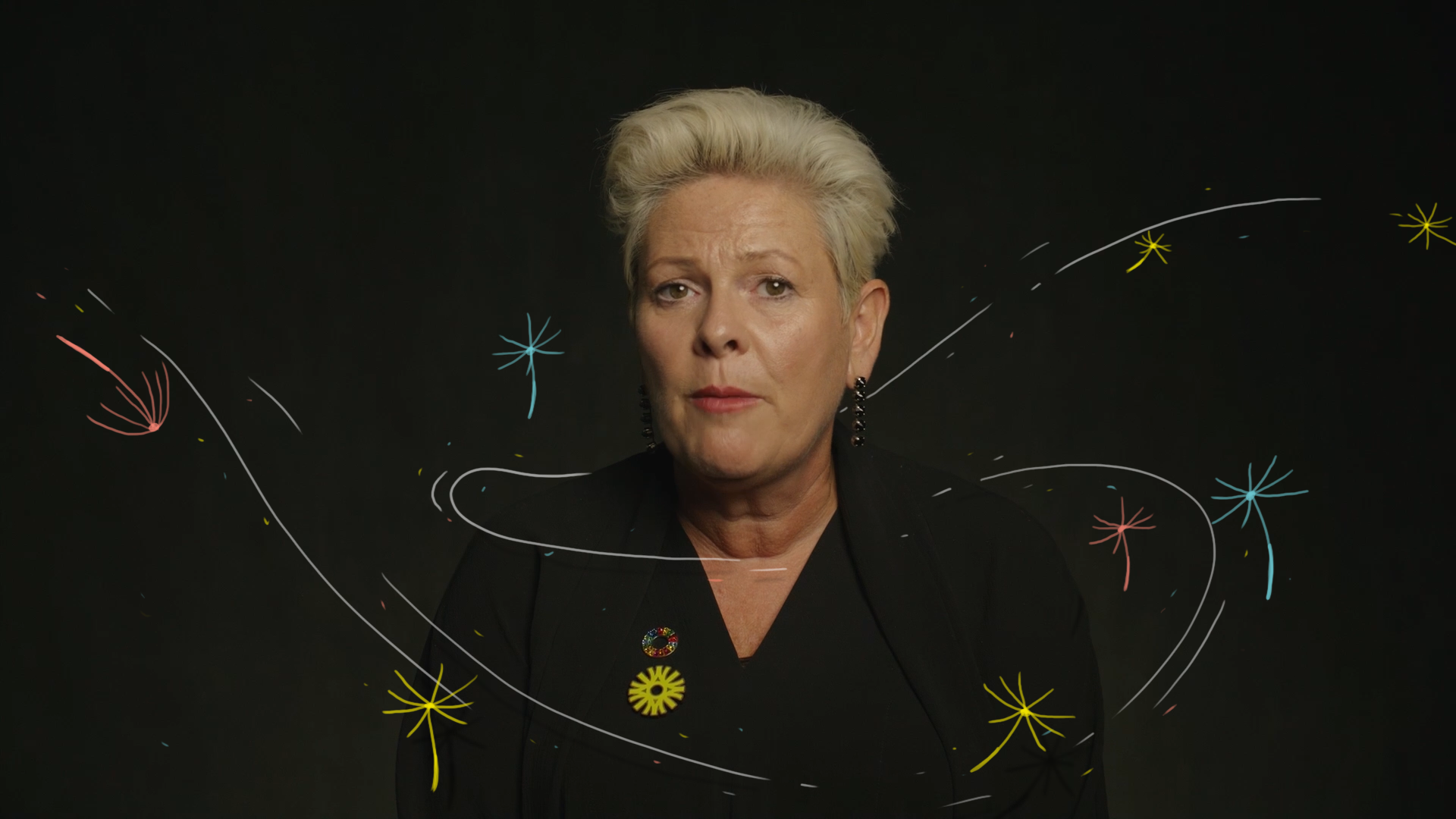
Project DANDELION
Creative and Art Direction for Project Dandelion.
Develope for Final Frontier and Nerdo.
For project Dandelion I helped the clients to find a minimal and effective solution in order to make the main Dandelion campaign video and the different social media assets more dynamic and interesting.
We created a minimal system of 2d animations directly interacting with the live action footage, achieving both an elegant final result and a more engaging “talking heads” video.
Why introduce this project? Because it shows how even a minimal and straightforward animation style can significantly enhance both the production quality and the overall impact of a video.
Next Project: MQ
︎︎︎

MQ
Oil and digital painted concept boards.
Developed for Trizz Studio.
Pitch project developed for Trizz studio in Barcelona.My task was to help Trizz come with a unique style for this project. I ve tried to go toward an unconventional way, creating a mixed media style able to combine 2D and 3D in a unique graphic approach.
The idea revolved around the use of real, archive or not, footage later on implemented through Trizz’s 3D power house and later on painted with both analog and digital techniques.
Next Project: VITRA
︎︎︎

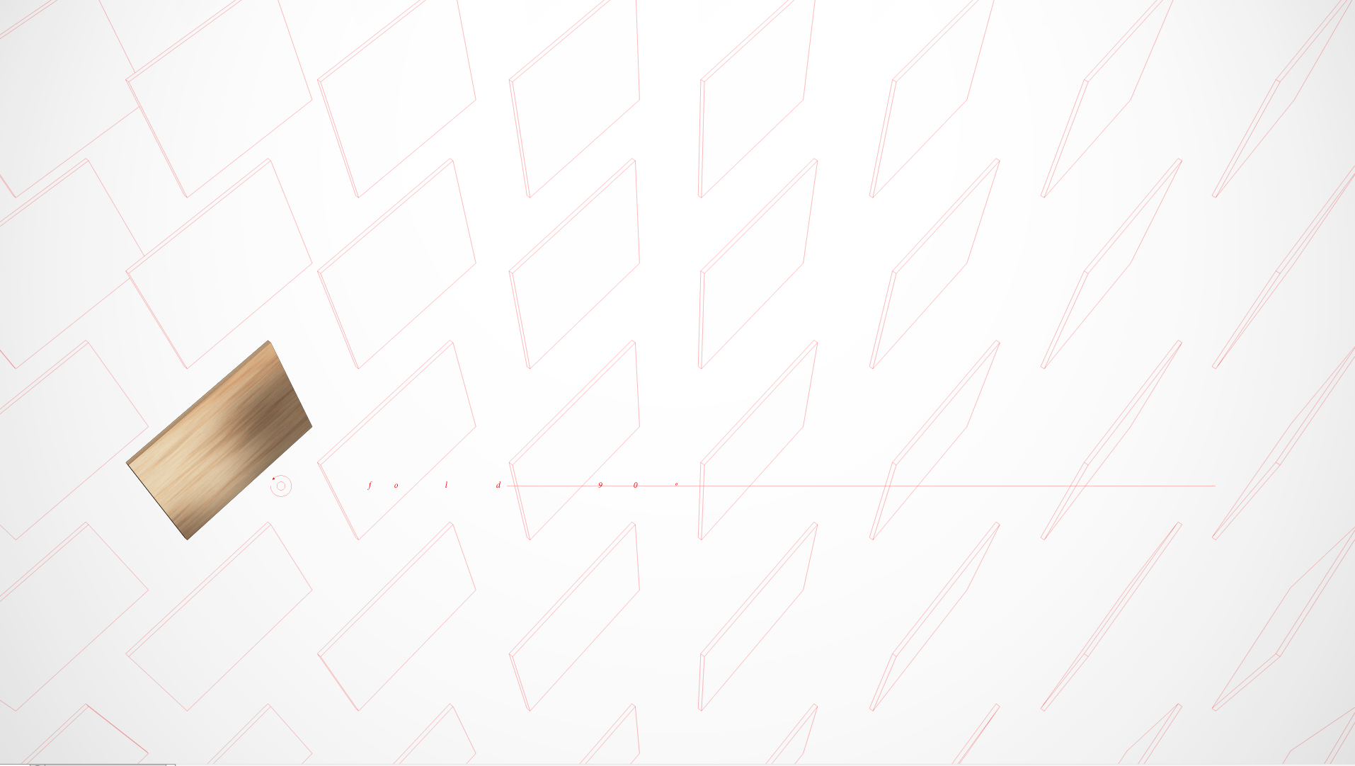
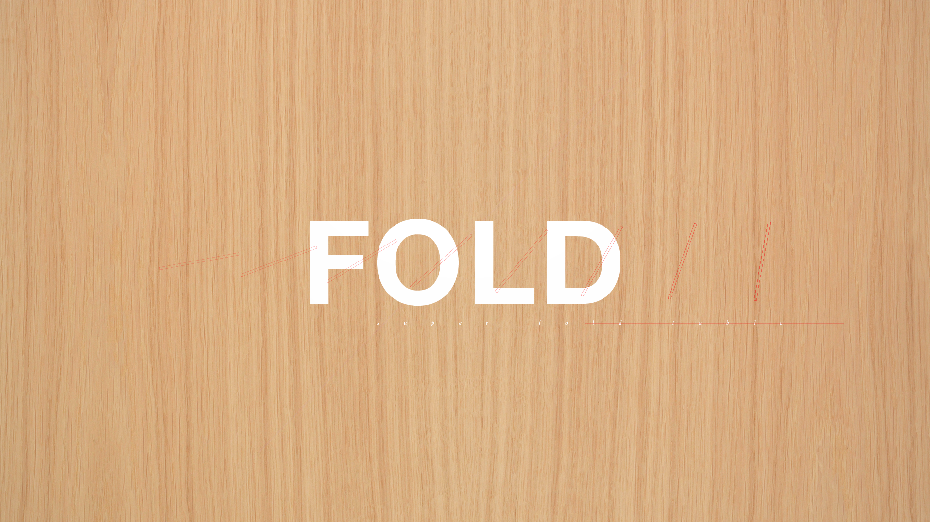
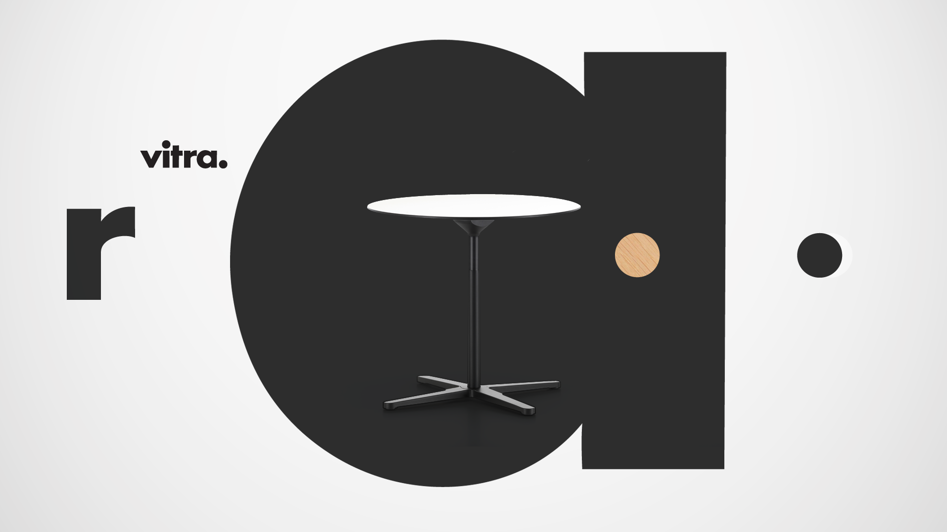
VITRA
Mixed meida concept boards for web commerical.
Developed for Jelly London.
For this project developed for Vitra and produced by Jelly London, I created a mixed media style with the intention of merging texture, product images, typography and blue prints into a dynamic animation able to portray the features and benefits of this new Vitra foldable table.
Next Project: The MVSEVM
︎︎︎

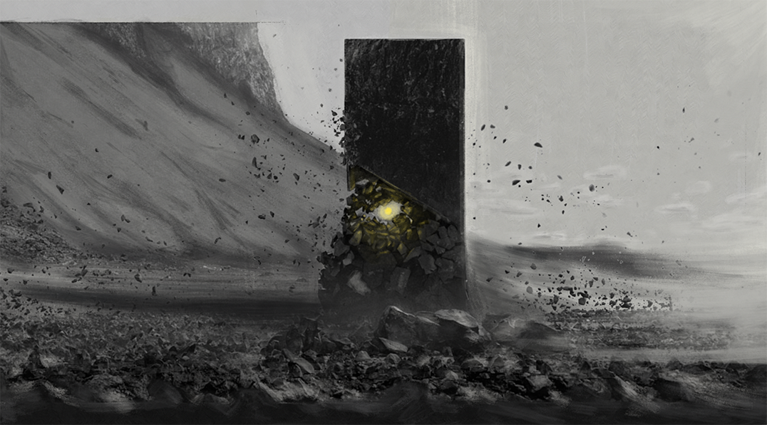
The MVSEVM
Concept boards for short film.
Created for NDA.
For this project I ve helped my client to re-interpret a possible visit to an art museum in a distant future. I ve got asked to both develop the concept and the art style.
My idea revolved around the concept of the failures of a society now (in the future) seen as art. From poverty to flying plastic bags as kinetic sculptures, a world after the world.


Next Project: Amazon
︎︎︎
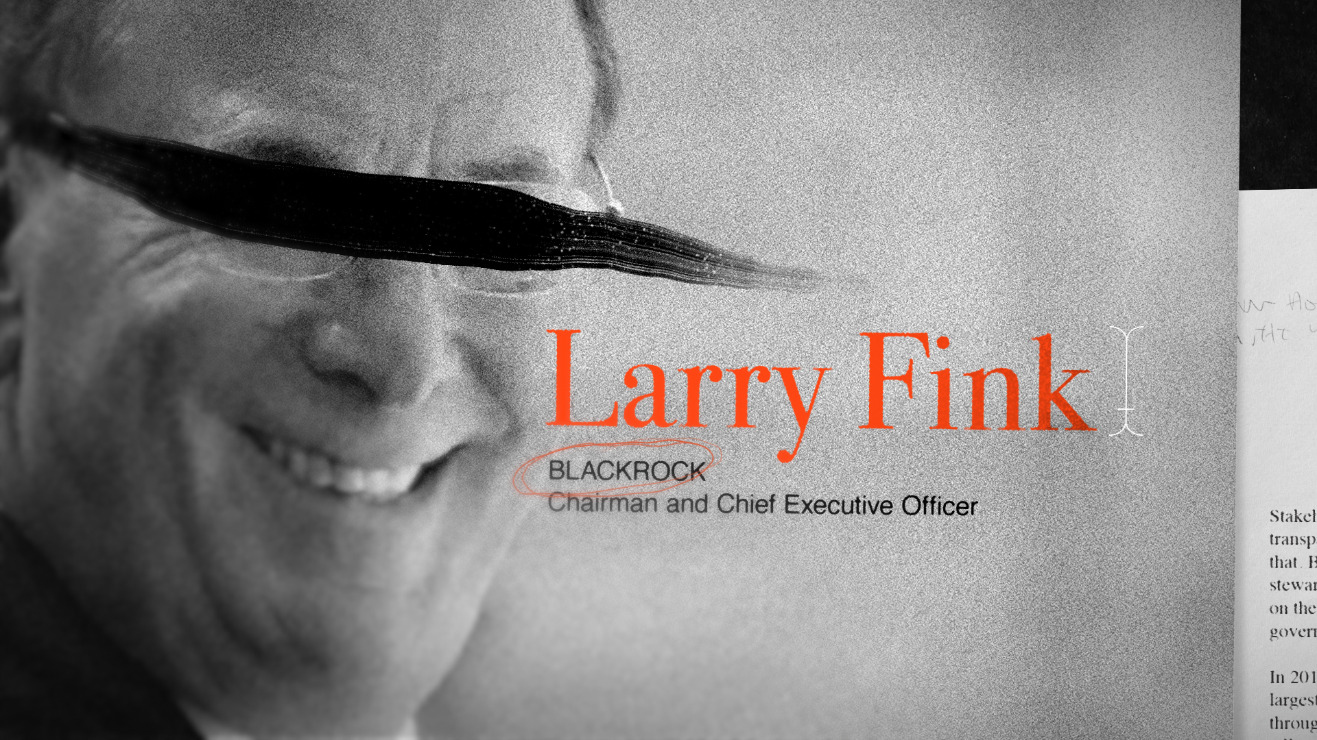
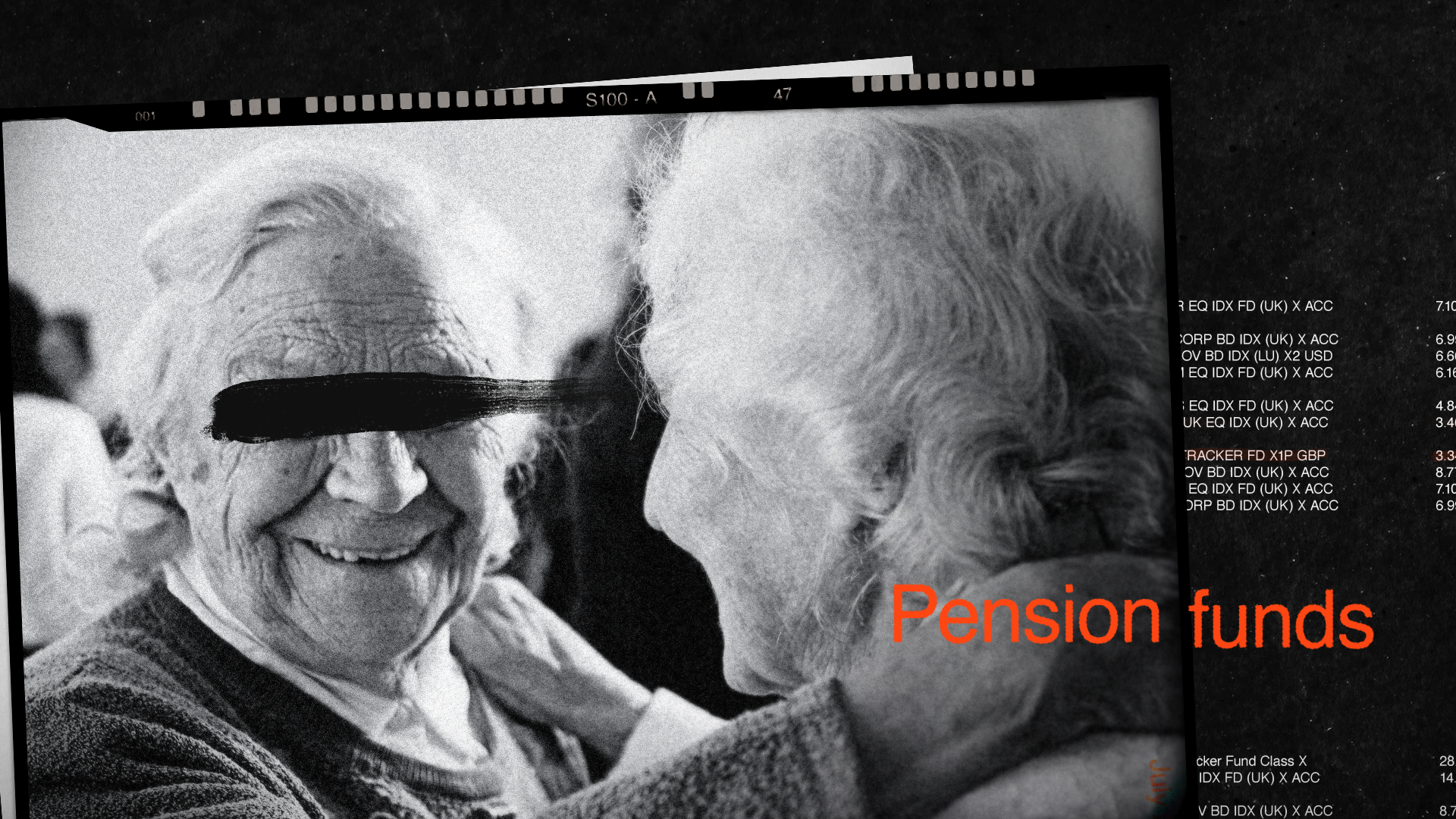
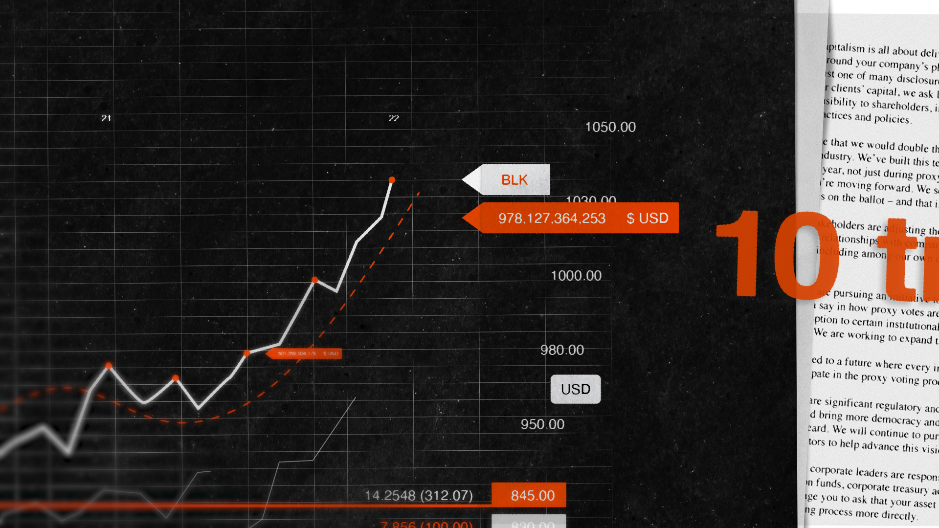
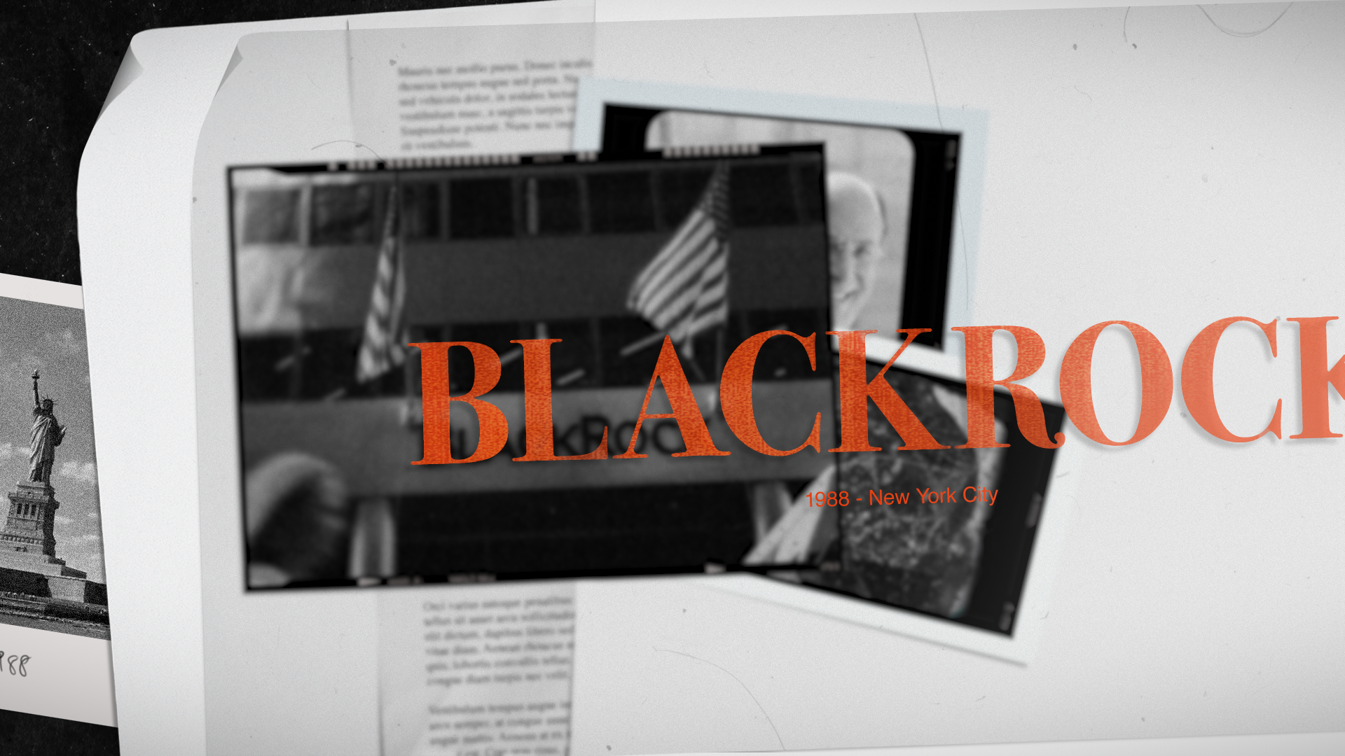
AMAZON: Black Rock
Concept boards for Amazon: The World’s Most Dangerous Show.
Developed for 27KM.
For this project I helped 27KM and the series’ director to visualise, design and develop the financial driven / abstract sections of the Black Rock episode.
The idea I brought was to utilise a “crime” / “financial-tech” language able to mix real documents and pictures with digital data and financial charts in order to highlight the complexity of the Black Rock system and support the narrative there where would have been impossible to represent things through live action.


Next Project: Area23 Pitch
︎︎︎

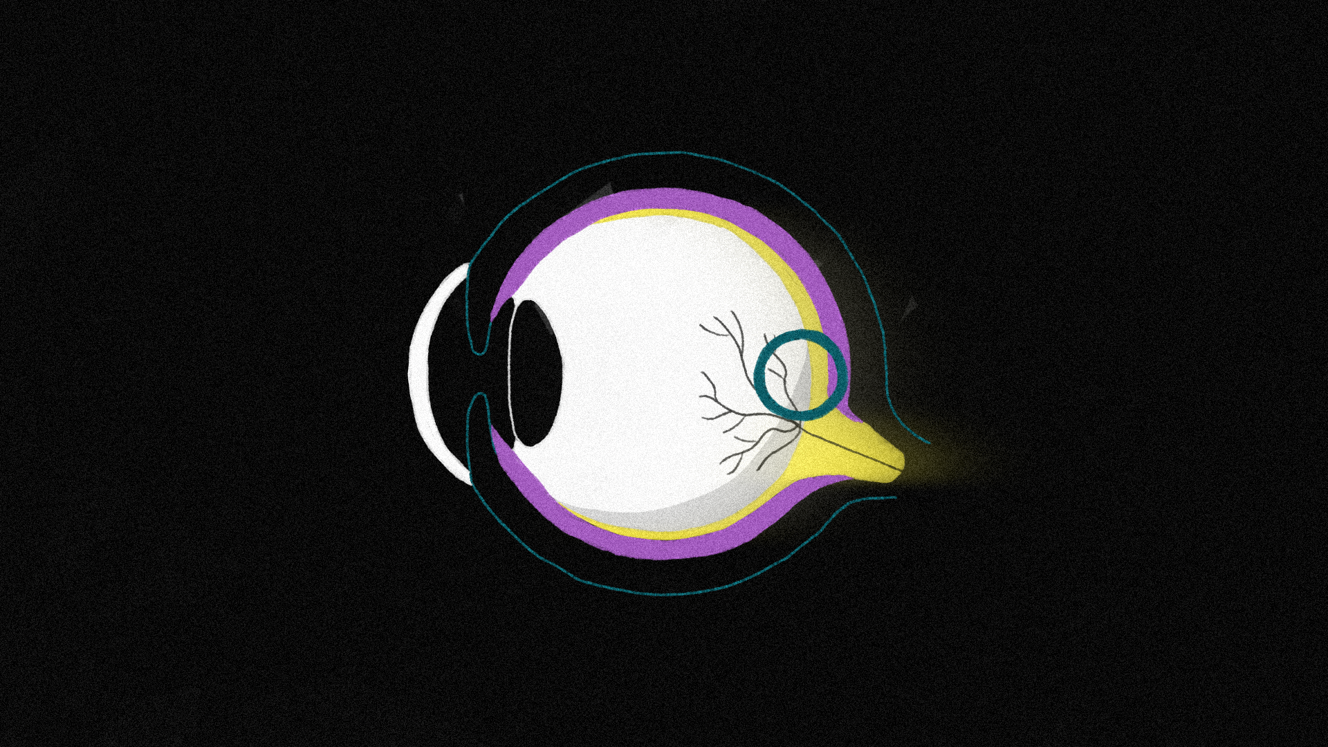
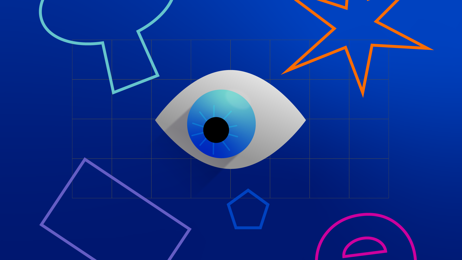
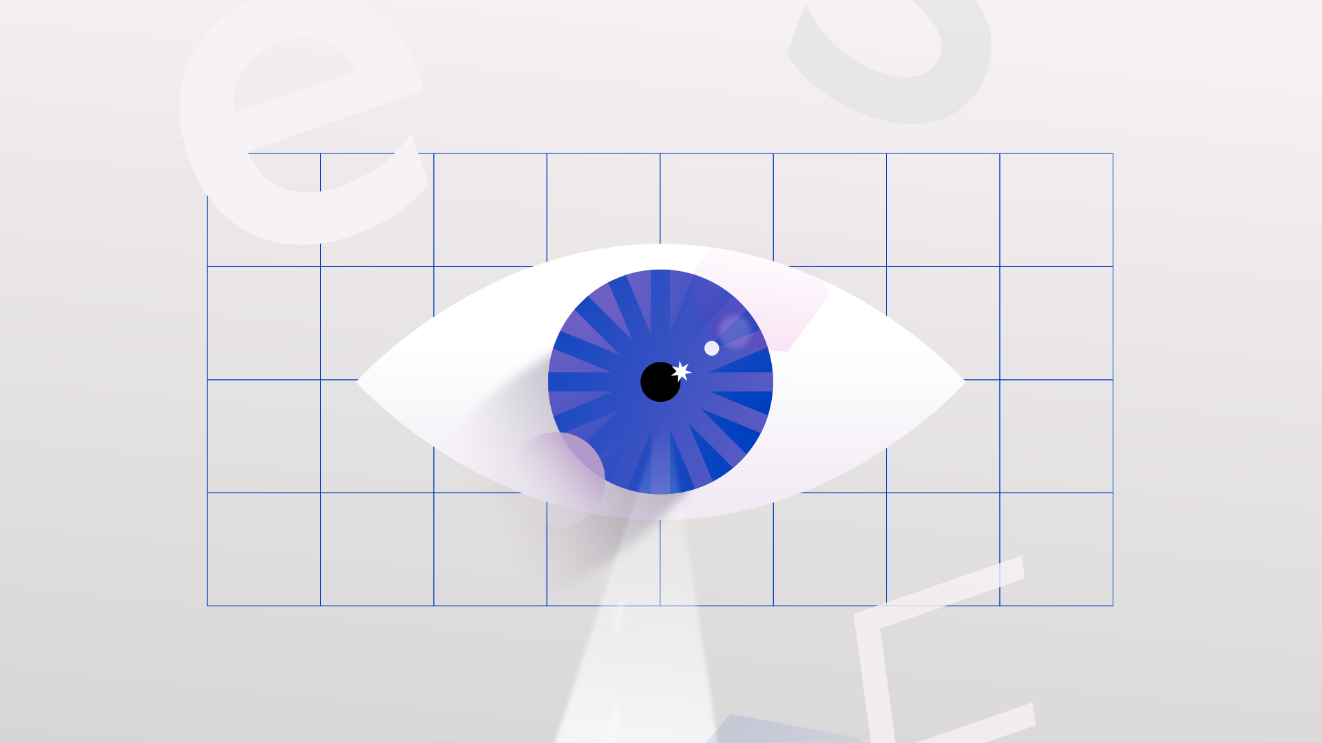
Area23 : Pitch
Concept boards + direction treatment for pitch.
Developed for Area23.
For Area23, I've developed key frames for a health/medical brand focused on eye functionality and how sight affects our daily life.
The entire video was based on and contained within a circle. With a limited color palette and a reassuring design, my proposal aimed to reassure and calm an audience in direct contact with patients affected by [specific condition I can not mention], while at the same time offering medical explanations and information in a precise and punctual way.
Sliding away from the 'classical' data-infographic video, the focus was on a narrative approach designed to easily communicate with people.

Next Project: Servus Credit Union
︎︎︎
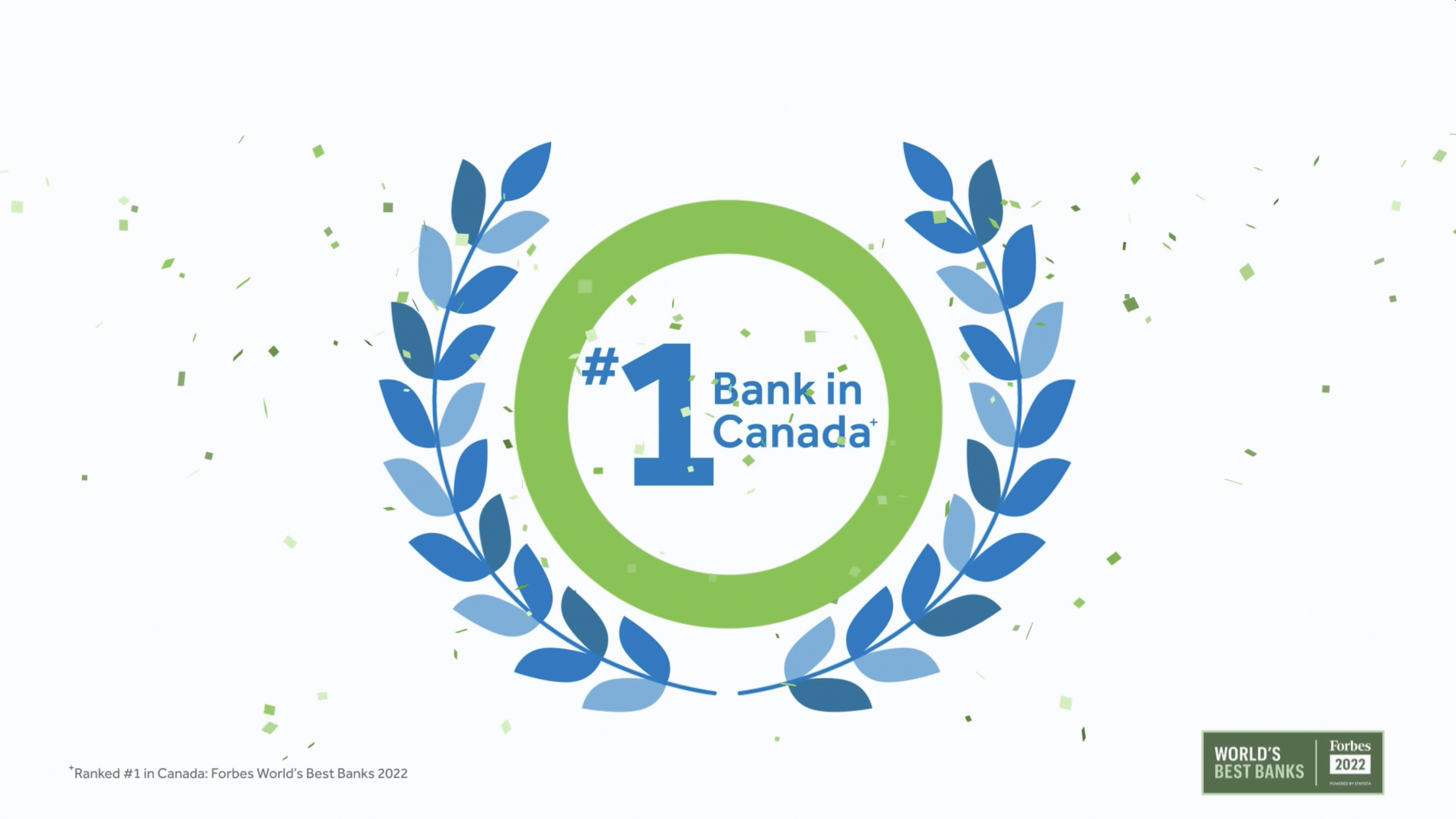
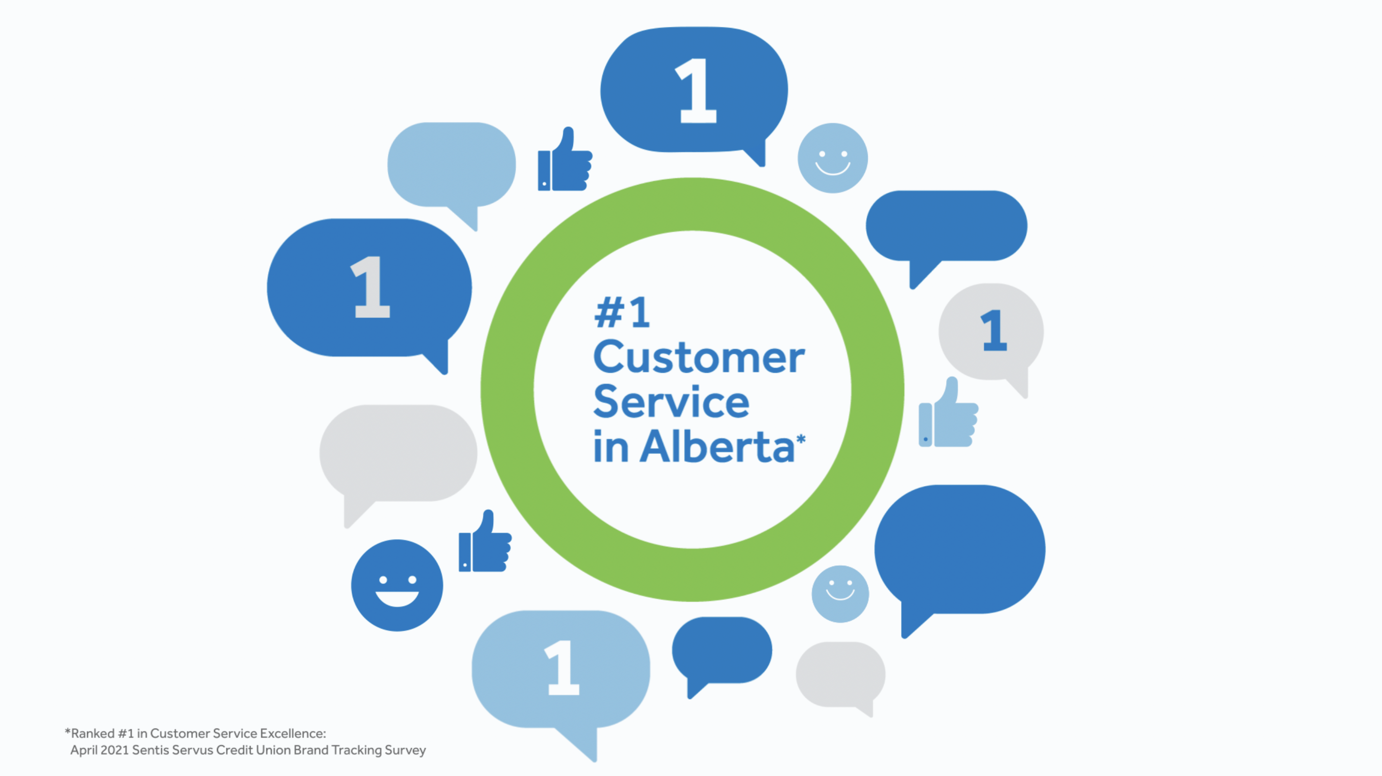
Servus Credit Union
Concepts and development for Servus Credit Union.
Developed for DDB.
For DDB, I ve directed and developed several motion graphic TV commercials for their Servus Credit Union campaign.
Siding their design team, we turned the agency storyboards into minimal, beautifully animated 2D videos, where the simplicity of the graphics, connected with the client guide lines, was contrasted by a more detailed animation, able to give life to the agency geometric approach.


Next Project: Adobe CC
︎︎︎
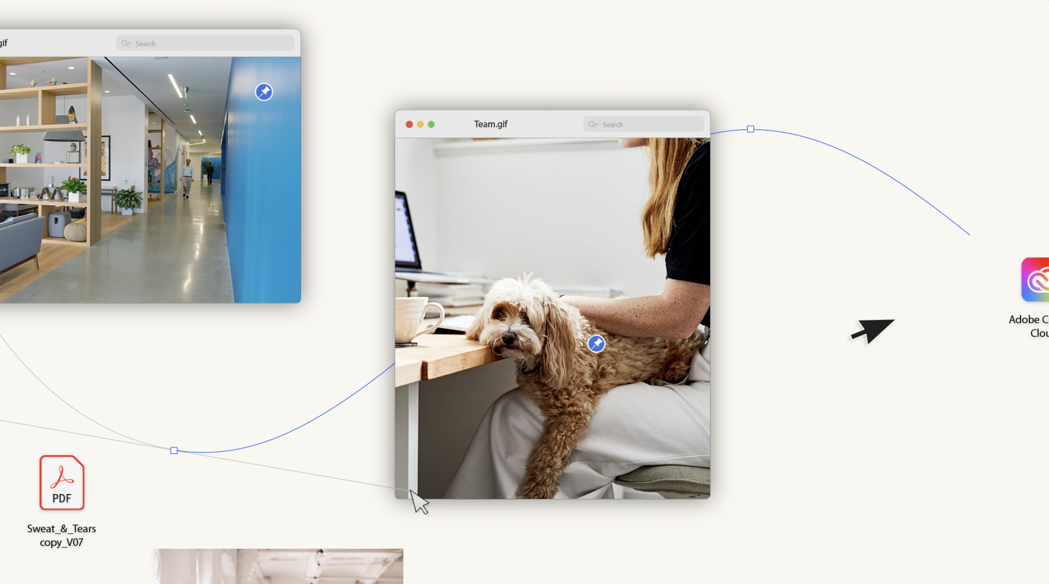
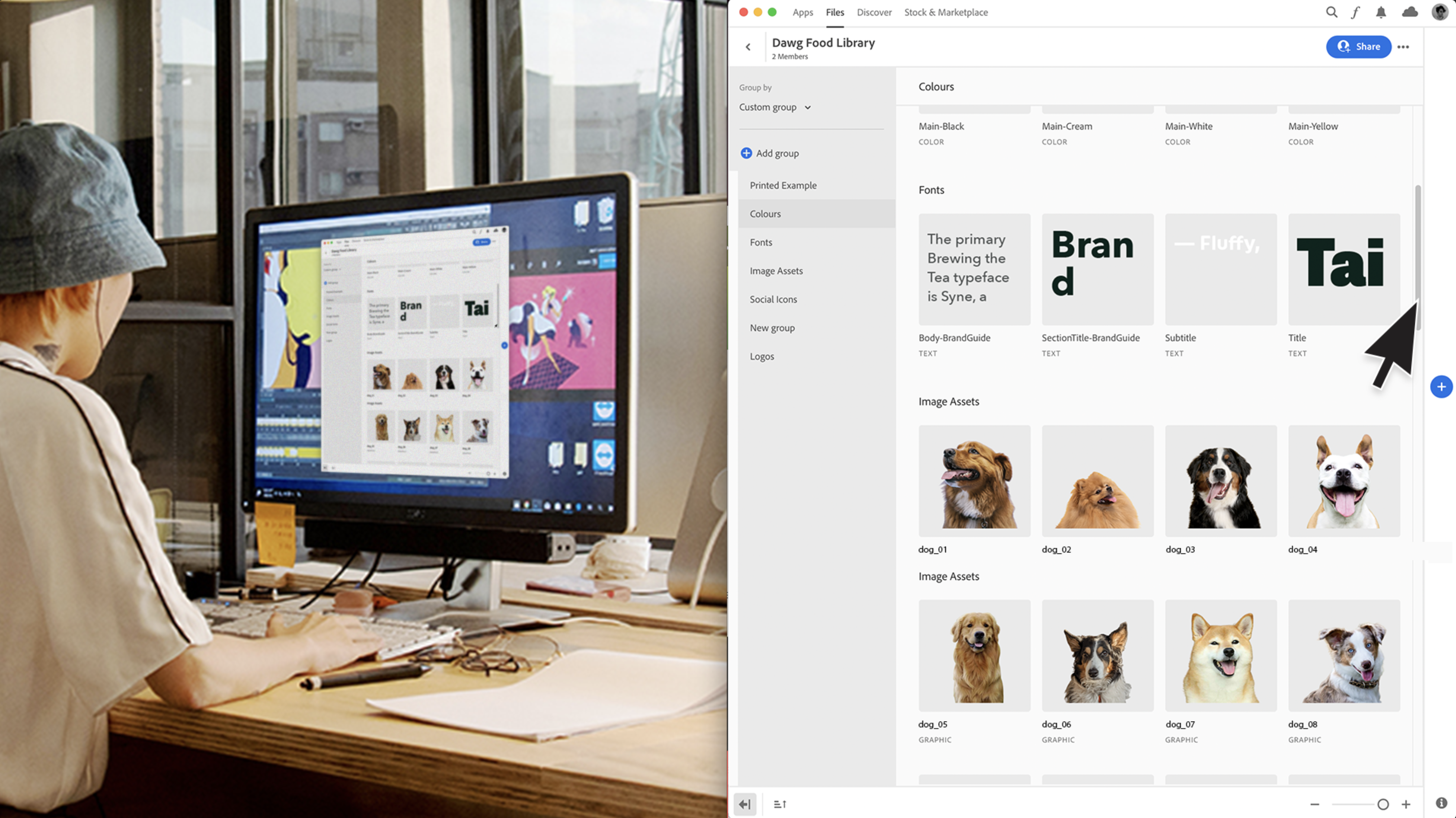
ADOBE CC
Concept boards for Adobe Creative Cloud 2022 presentation video.
Created for Jam3 Toronto.
As Art director on this project I ve helped the team of Jam3 to develop a mixed media style for the Adobe CC ’22 video presentation.
I was asked to created the art both for the live action video and for the animation. My idea was to create a mixed media style able to mix footage with a simplified UI of the Adobe suit so to move from video to animation back to video in a seamless way, as if the entire commercial was spread around a computer desktop.

Next Project: NDA Feature Film
︎︎︎
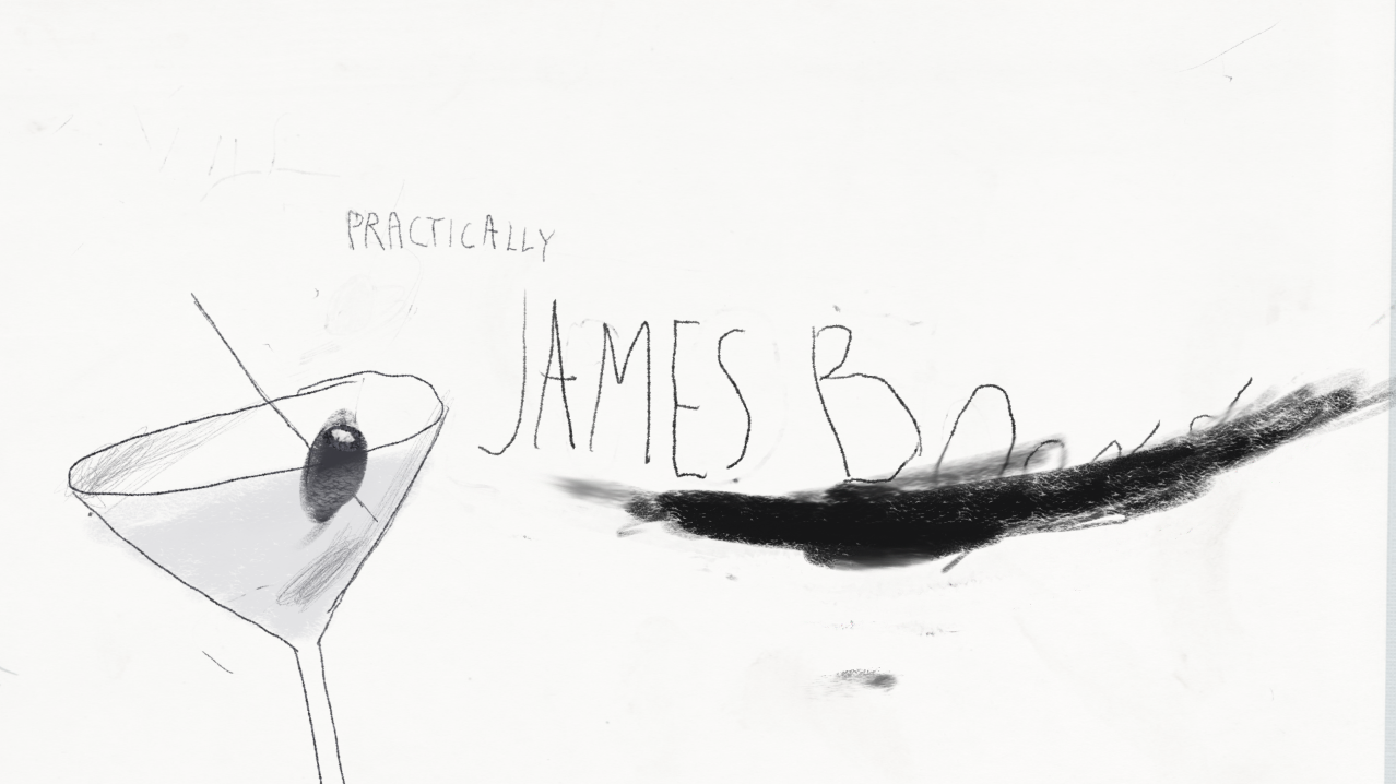
NDA Feature
Concept boards for NDA feature film.
Created for Creative Mammals.
For this pitch I ve been asked to create a black and white childish, naive style able to represent the narrative through the “eyes” of a kid.
For supporting the voice over what I proposed was a blend of naive illustrations, able to visually describe the main actions, and simple childish hand drawn typography, highlighting those key words we wanted the audience to focus on.
The animation, due to the nature of the graphics, was thought to be complex and dynamic in order to create a conceptual contrast among what the spectator saw on screen and the intricacy of the actions.

Next Project: Essilor
︎︎︎

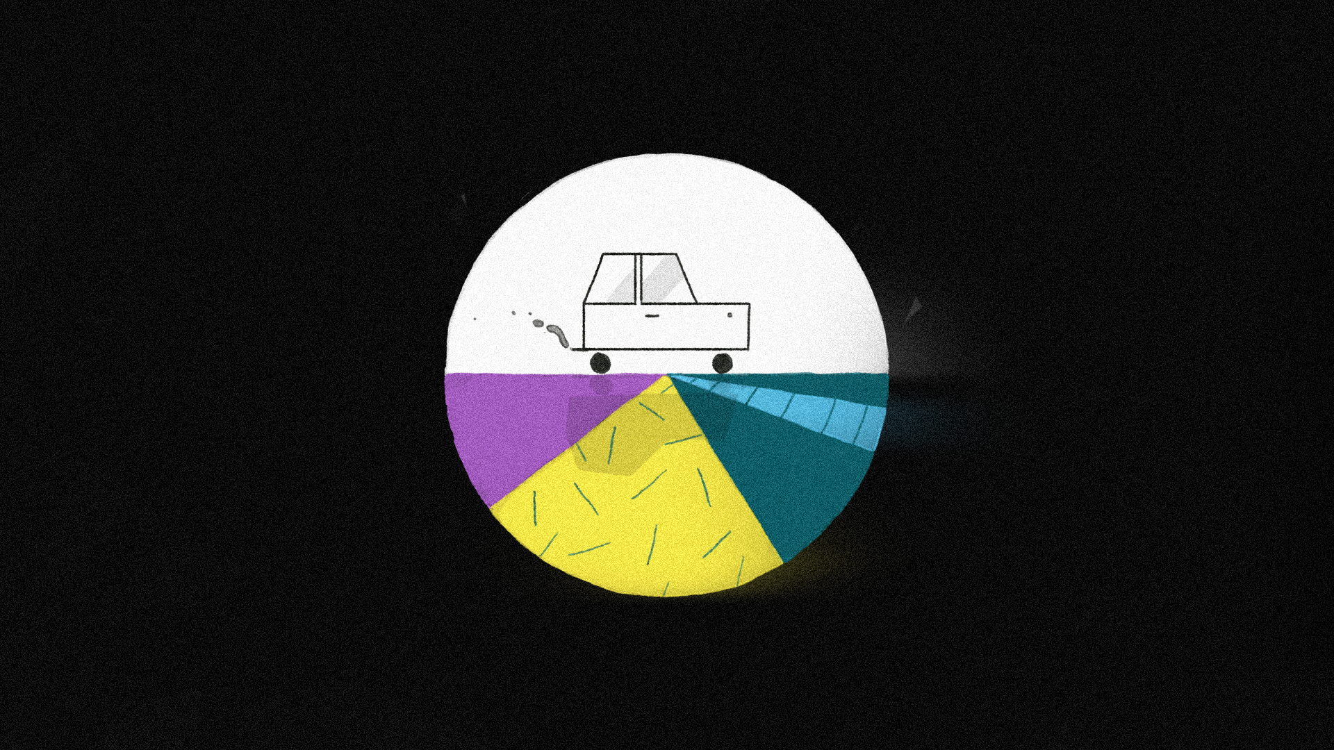
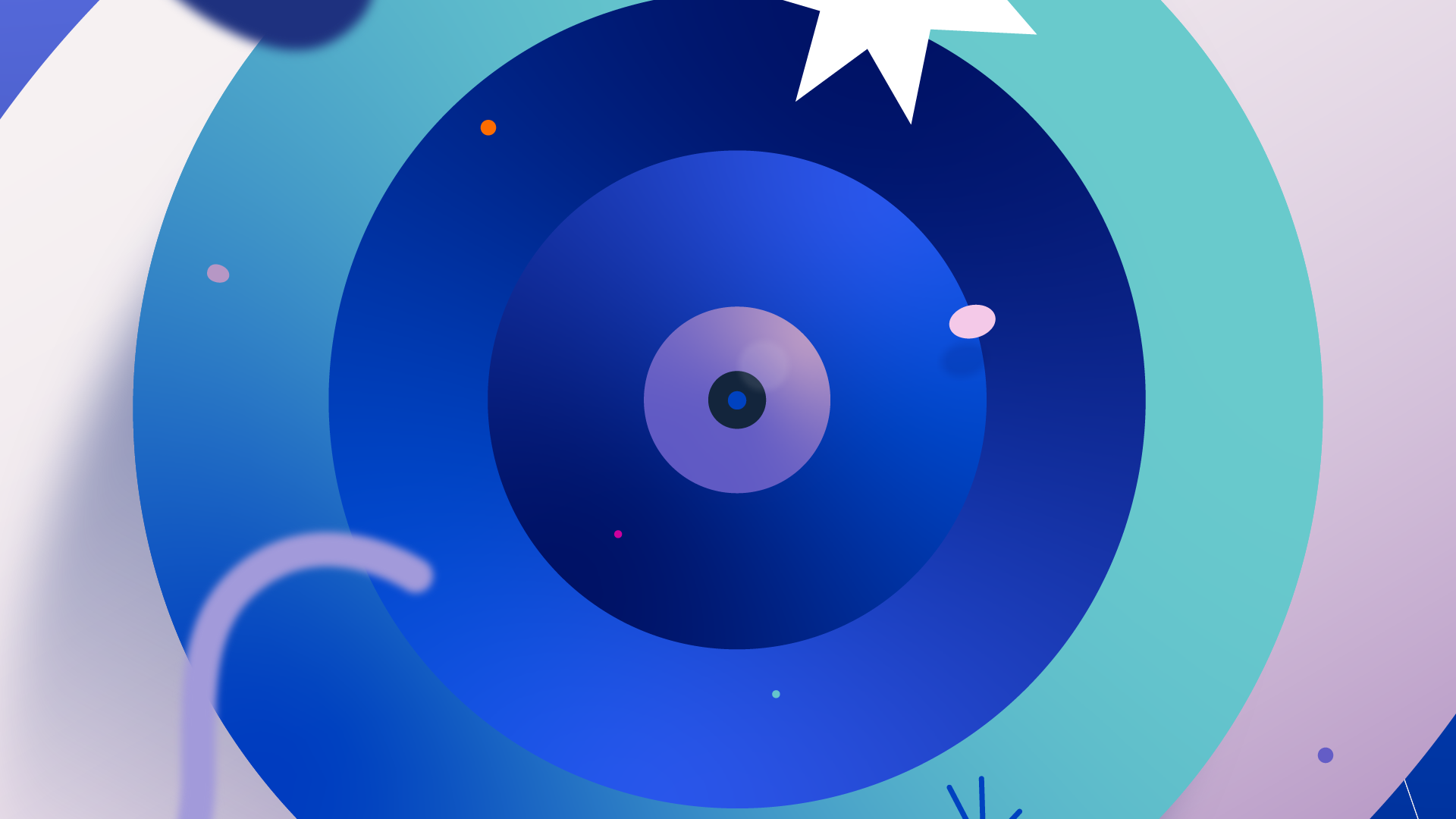
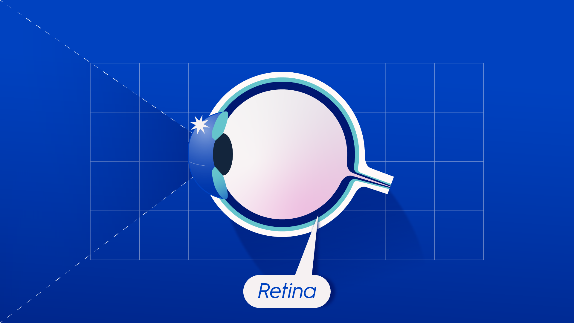
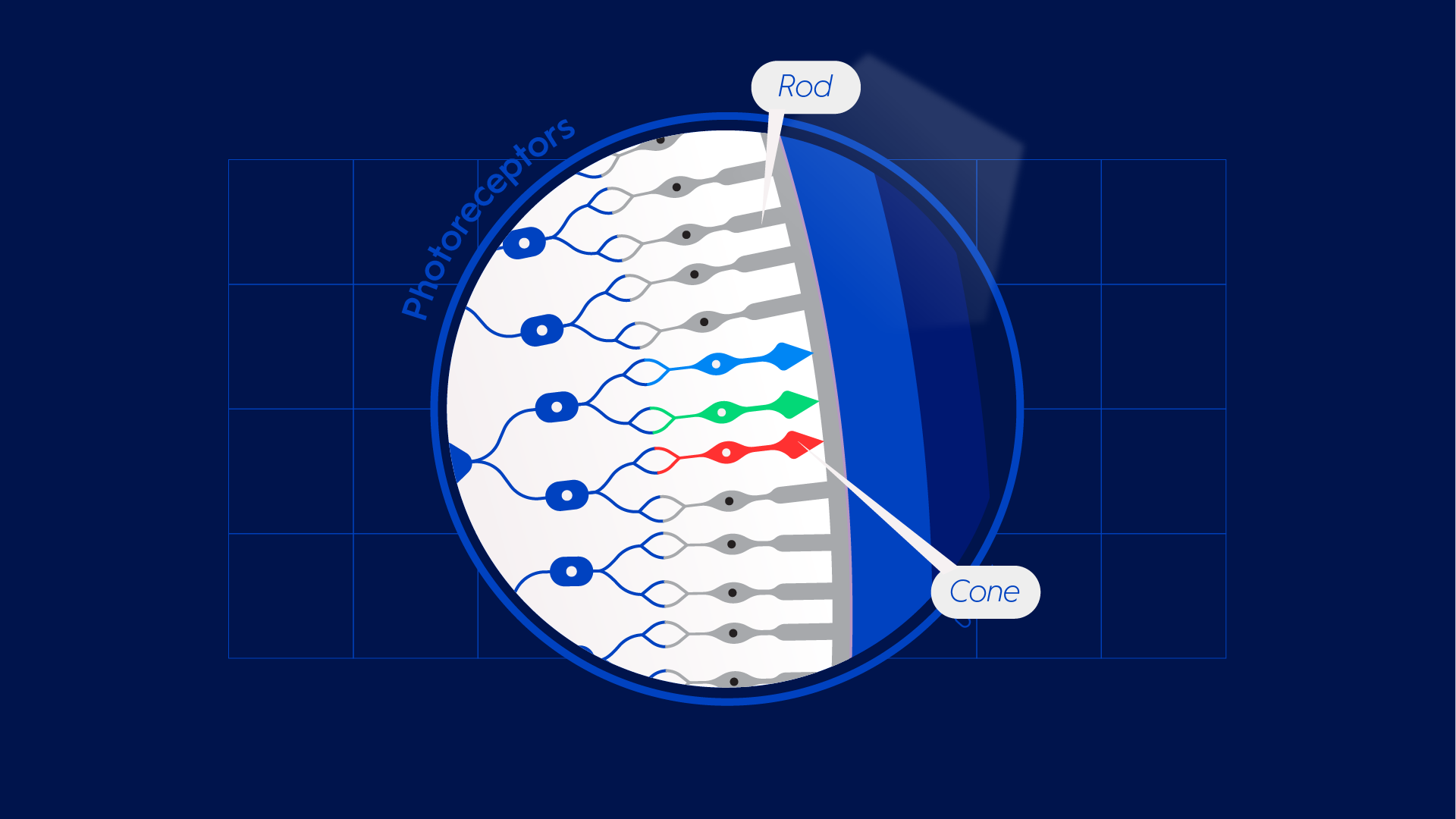
Luxottica - Essilor
Web and social videos for Luxottica group, Essilor.
Created for Nerdo Sturio
For Essilor and Nerdo, I've directed and designed a short series of 3 scientific web/social videos. The idea was to combine precise medical and scientific information with a modern, playful style able to entertain a wide audience.
The videos, focused on the functionality of the eye, were meant to describe how we see, how we process images, and how our sight adapts to a drastic change of light, like day and night.


Next Project: Xerjoff
︎︎︎
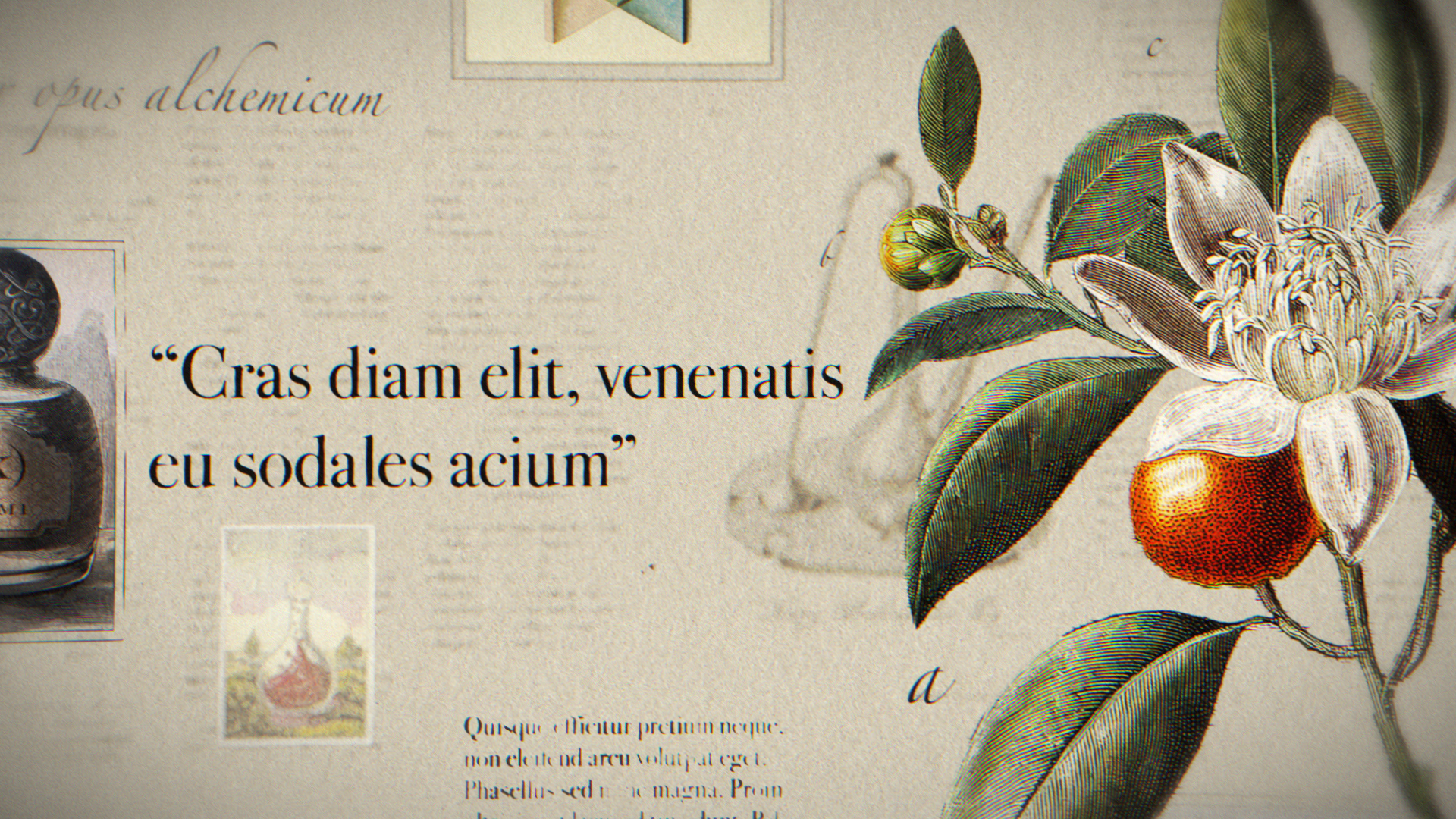
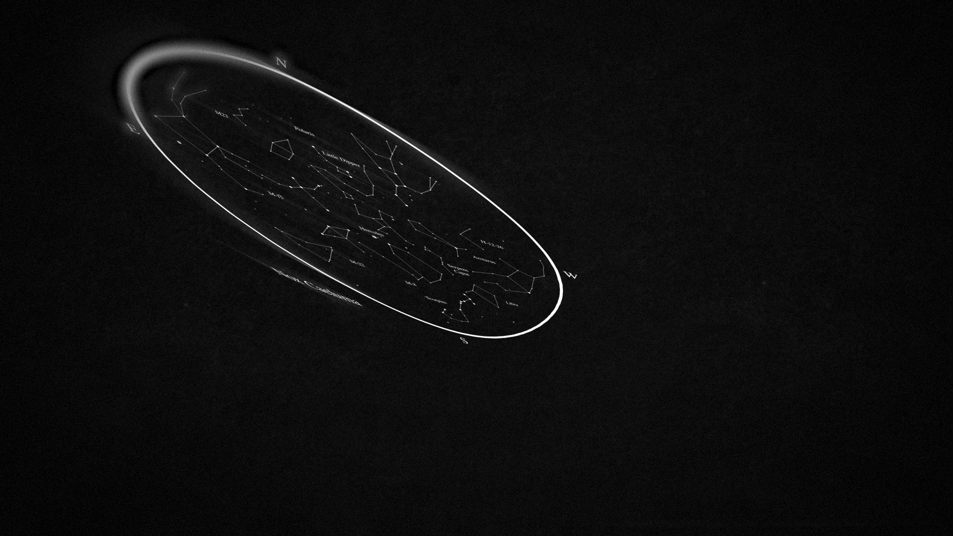
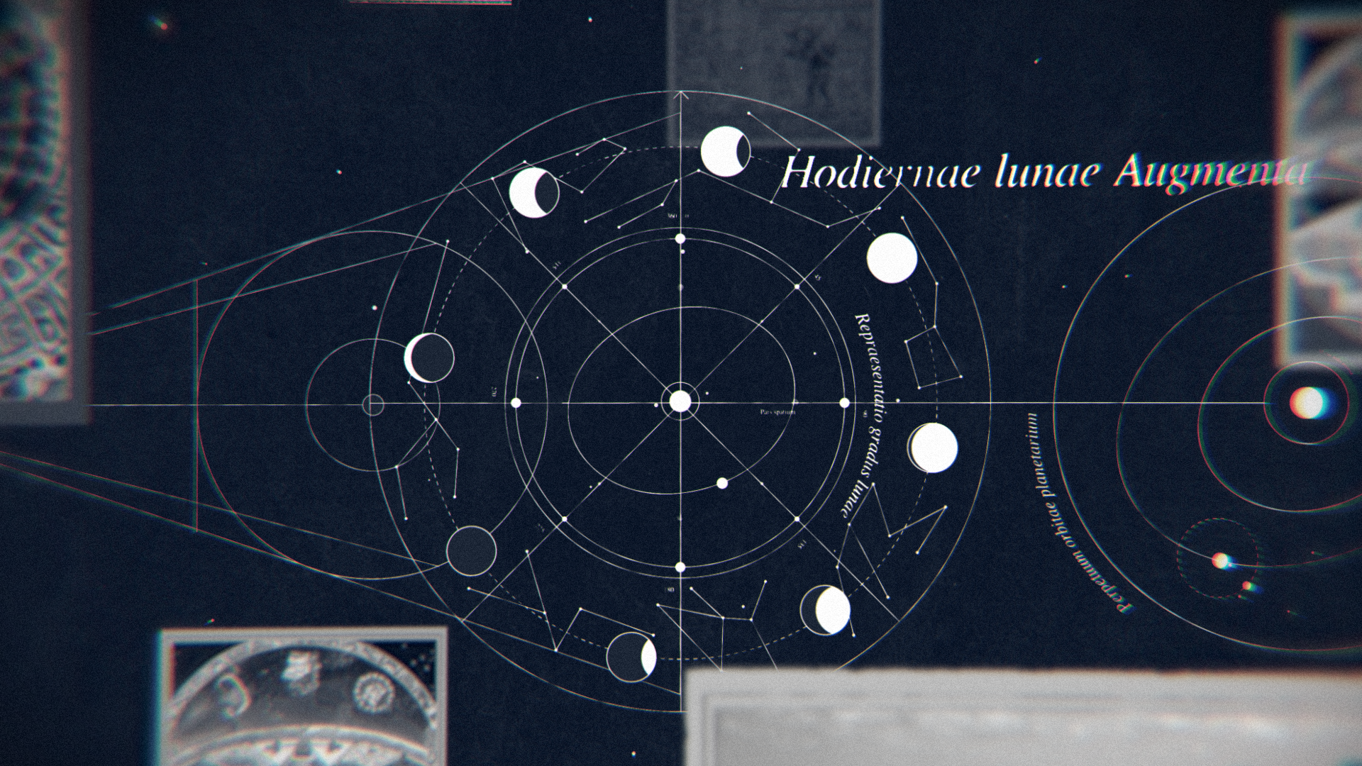
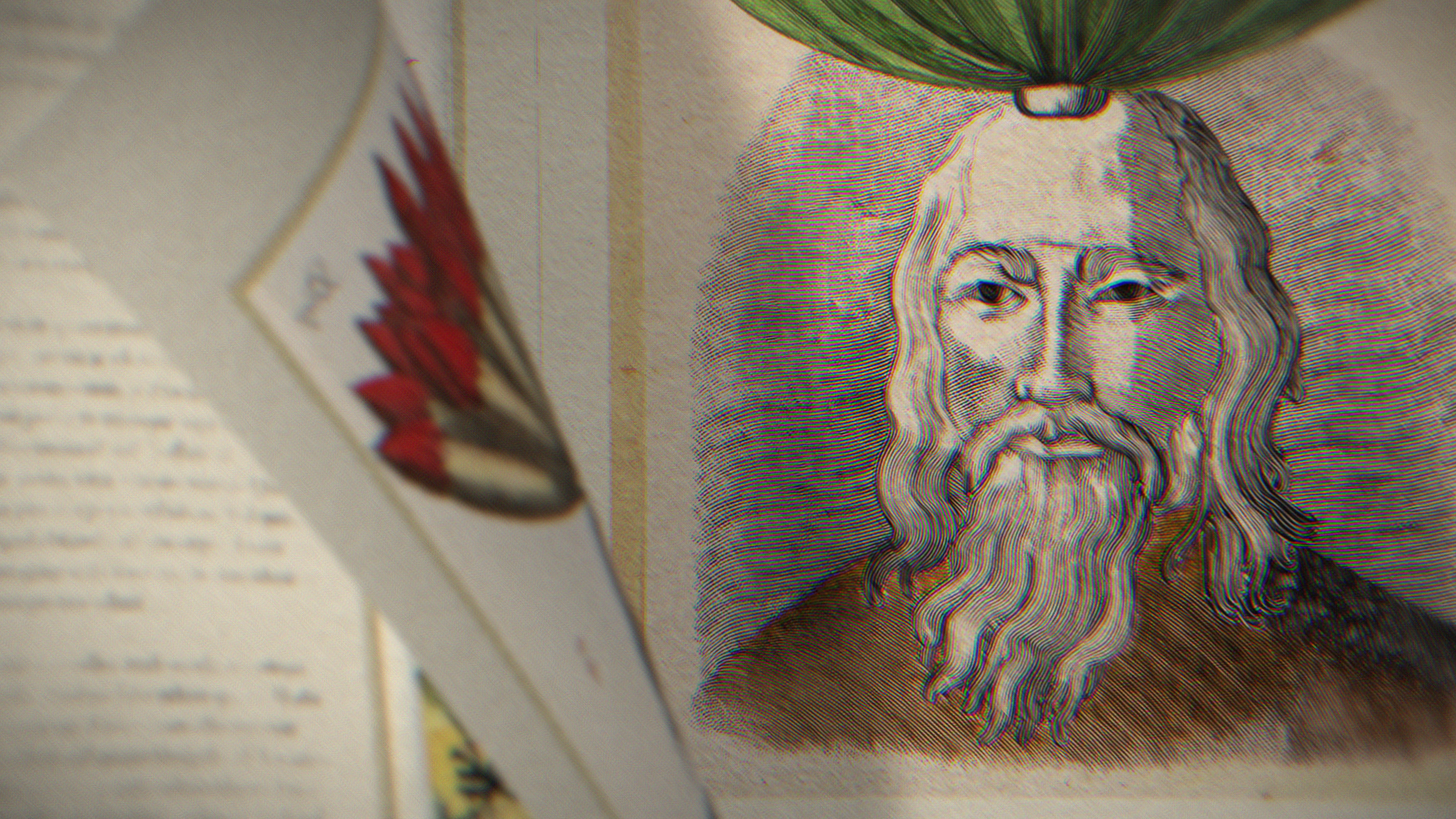
Xserjoff
Launch videos for Xserjoff new perfumes
Project created for Xserjoff new Kemi perfumes, through Nerdo. My task was to come up with 2 different styles for the perfumes themes: Alchemy and Maya.
The idea was to don’t be literal and work on themes around the two main topics. In this case I selected Spagyria and Astrology creating some 2.5D concept boards able to mix both graphics, illustrations and real product images. The boards were also meant to contain extra details referring the perfumes origins and different compositions.