Translating Ideas into Visuals:
The Art of Styleframes
Animation, Short Film, 2D, 3D, Mixed Media.
Styleframes are widely used in design, animation, games and films. They consist of a visual representation of a specific scene, moment or transition and are meant to illustrate how something can look before it enters production. They are a fundamental step in most pitches, exploration and pre-production processes, but what does it take to create a board? Or a full set? Is it just pure visualization or is there something else? This case study is meant to answer these and more questions and to analyze how creating styleframes involves direction, balance, interpretation and technical skills.
If you are curious about some recent styleframes I have created for main titles, commercials and short films, you can head directly to this section of the website: “Stills”, while if you want to understand what is the line of thought and process behind them, this case study is for you.



Creating images is a complex Art
Creating images seems simple, in particular nowadays where software and now even AI can generate images with just text prompts or few inputs; This could lead one to think that creating Styleframes is something easy and within everyone’s reach, but it is not.
Designing Styleframes is a complex art that is not that much about making beautiful images as it is about precisely translating specific concepts into understandable and appealing visuals that convey information, tell a story and entertain.
It is something that takes time, something that involves both technical skills and a wide understanding of the project; objectives, challenges, constraints and in particular its audience. Yes, the audience, because Styleframes are, of course, meant to show how something may look but finally are addressed to a public which needs to be able to understand and read them easily.
In 15+ years I have created a wide variety of Styleframes, below I am going to analyze some specific challenges and how we solved them during the process of creating Styleframes.

Discover more about this project on Deconstructions Case Study ︎︎︎
Example 01 • Spotify
Solving challenges: Visualization with an objective
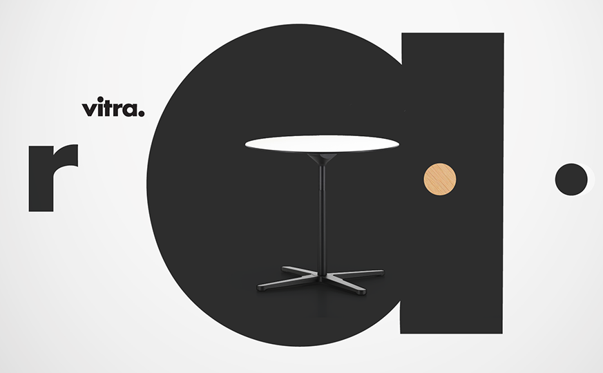
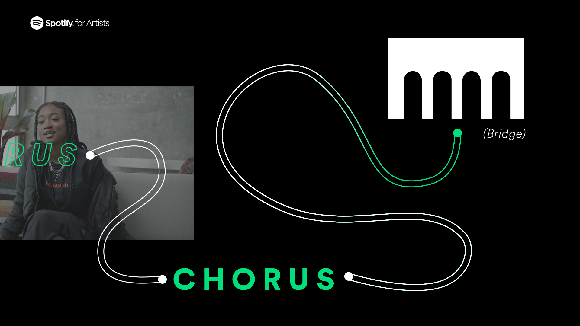
Creating Styleframes is certainly about visualization but also about solving challenges; in this project developed for Spotify, the brand wanted to create an entire series dedicated to understanding how to create songs. It had 10 episodes and they had the need to explain and visualize specific moments and informations through the use of graphics.
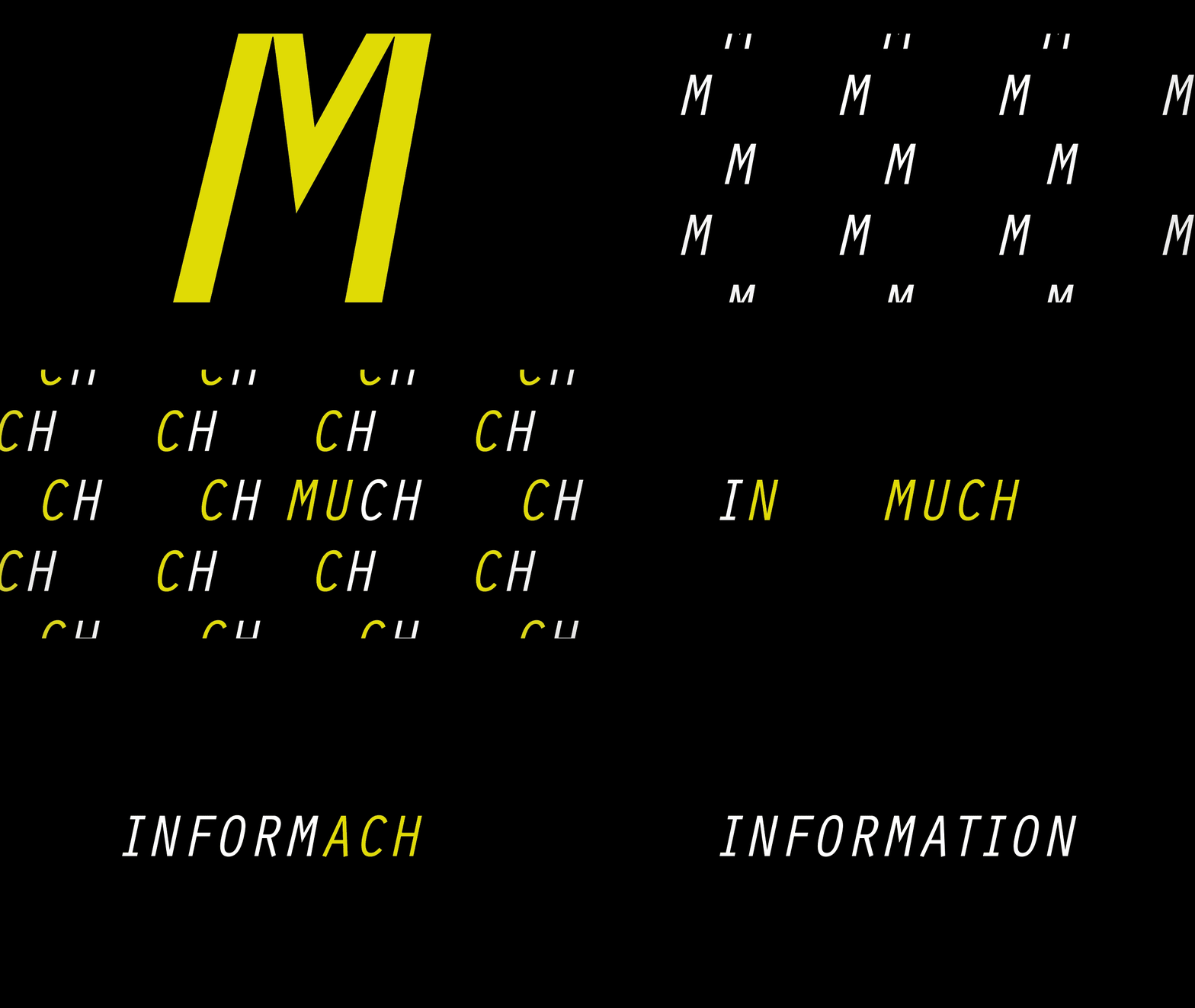
Everyone wants their videos to be attractive, but in this case, there was some work to be done; Many text infos that needed to be displayed in an interesting way. My job was to think how to make a series of elements like bullet lists, graphs, lip-synched words, charts work nicely, not being boring and fit the overall Spotify brand.
What I thought and designed was a slick motion graphic system able to “decompose” both the video editing and all the text assets and re-arrange them in a spatial way aimed to consider the time factor. This means that whatever was a static asset has been redesigned and distributed in space, the videos which spent a lot of time on a single point now were more dynamic and we would be able to move from asset to asset, from bullet point to bullet point through 2D camera movements.
My entire idea was to re-imagine specific assets then find a way to portray them “in time” (length of the video), so not having just a list on screen but something more dynamic that we could follow with ease. The last touch was to bring everything as close as possible to Spotify guidelines but still keeping some freedom of design.
Translating print layouts into video, introducing a minimal illustration language and mostly re-organizing everything helped me creating the boards you can see here and the company start the production.



Example 02 • Sarofsky X Netflix
Styleframes are not just self-explanatory images, they should tell a story
Good sets need to tell a story, not just showcase nice moments; Styleframes’ objective is to translate and represent, this is easy when working with pretty grounded scripts, explanatory videos or everything where the connection meaning -> words -> visuals is pretty straightforward.
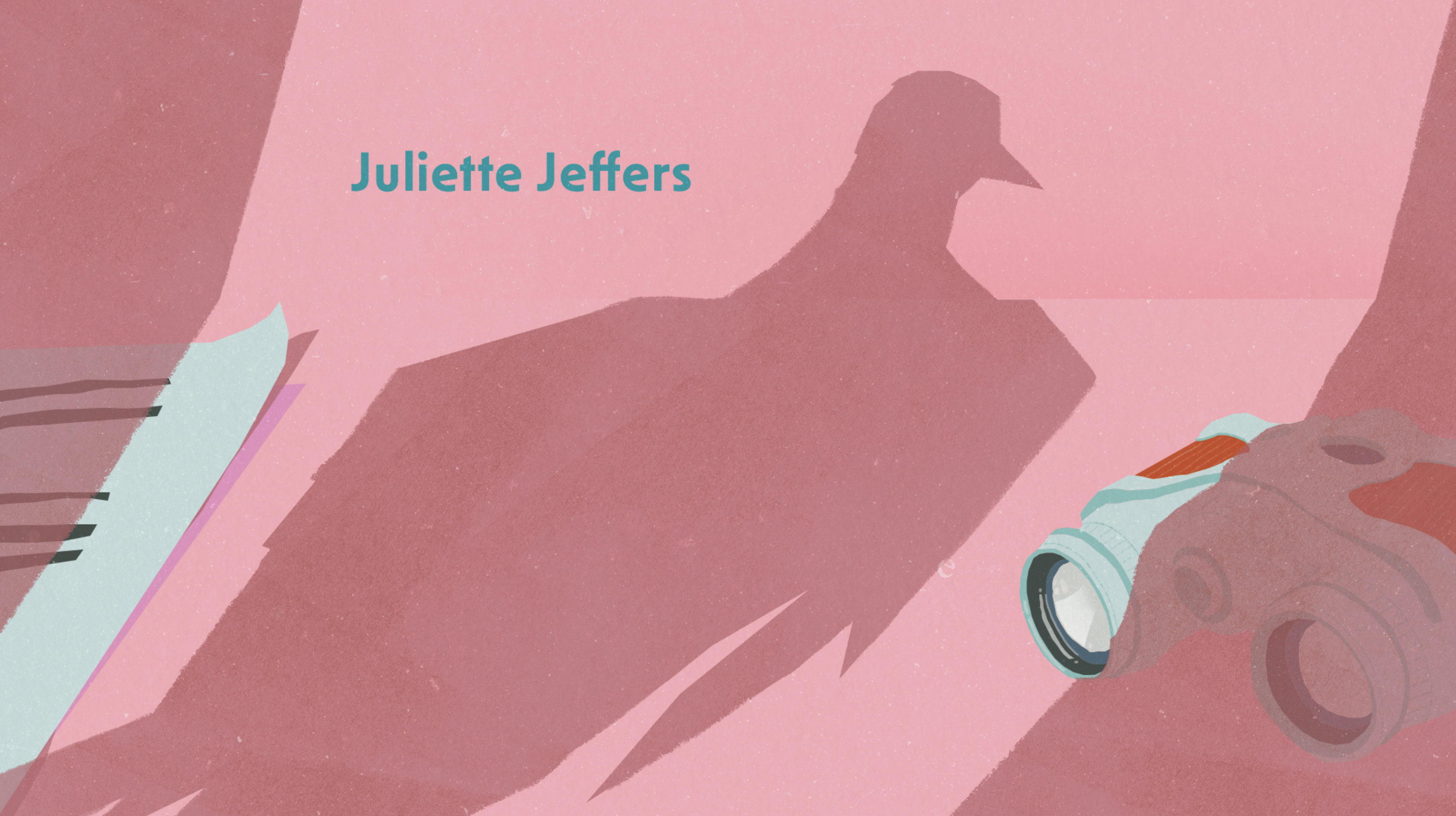
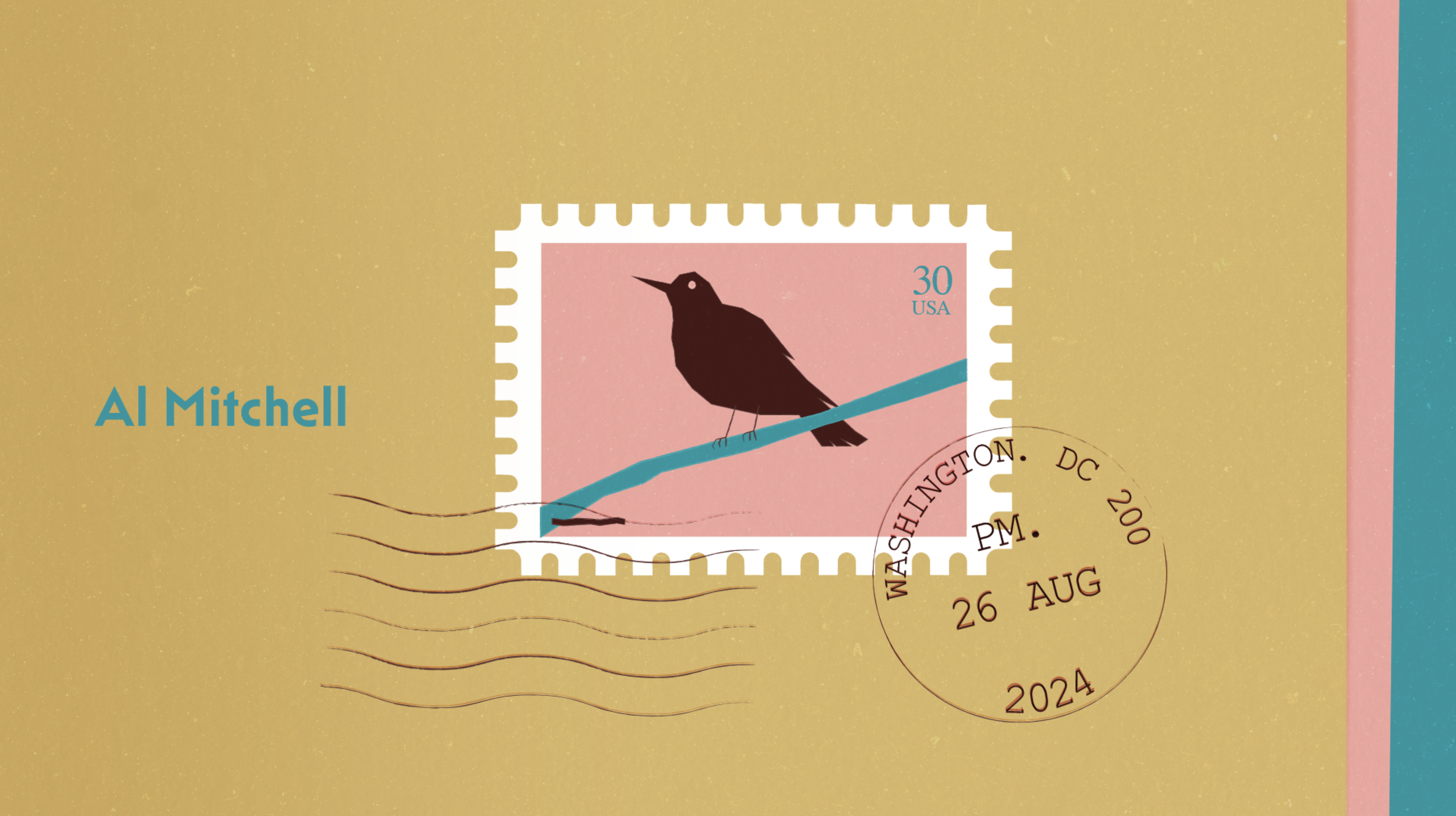
But what happens when working on movie titles or more elaborated concepts? We need to tell a story, and Styleframes are the perfect tool to do so. More elaborated than sketches and resembling almost final frames, fewer in number compared to a storyboard frames, Styleframes need to convey a bigger picture, provoke an emotion and help as grasp what it would be. In this example, developed for Safrosky and Netflix, I explored the “story behind the story”.
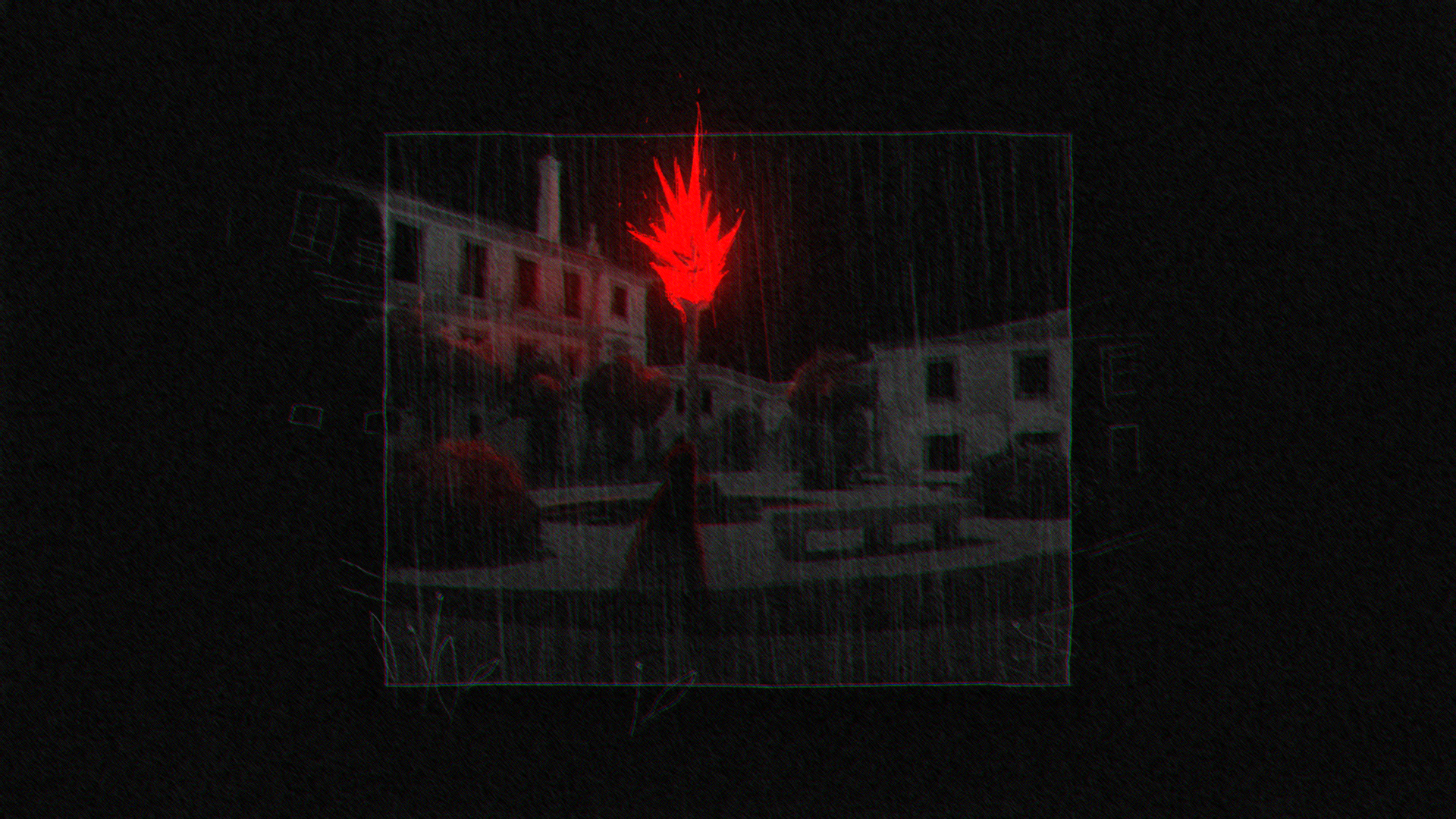
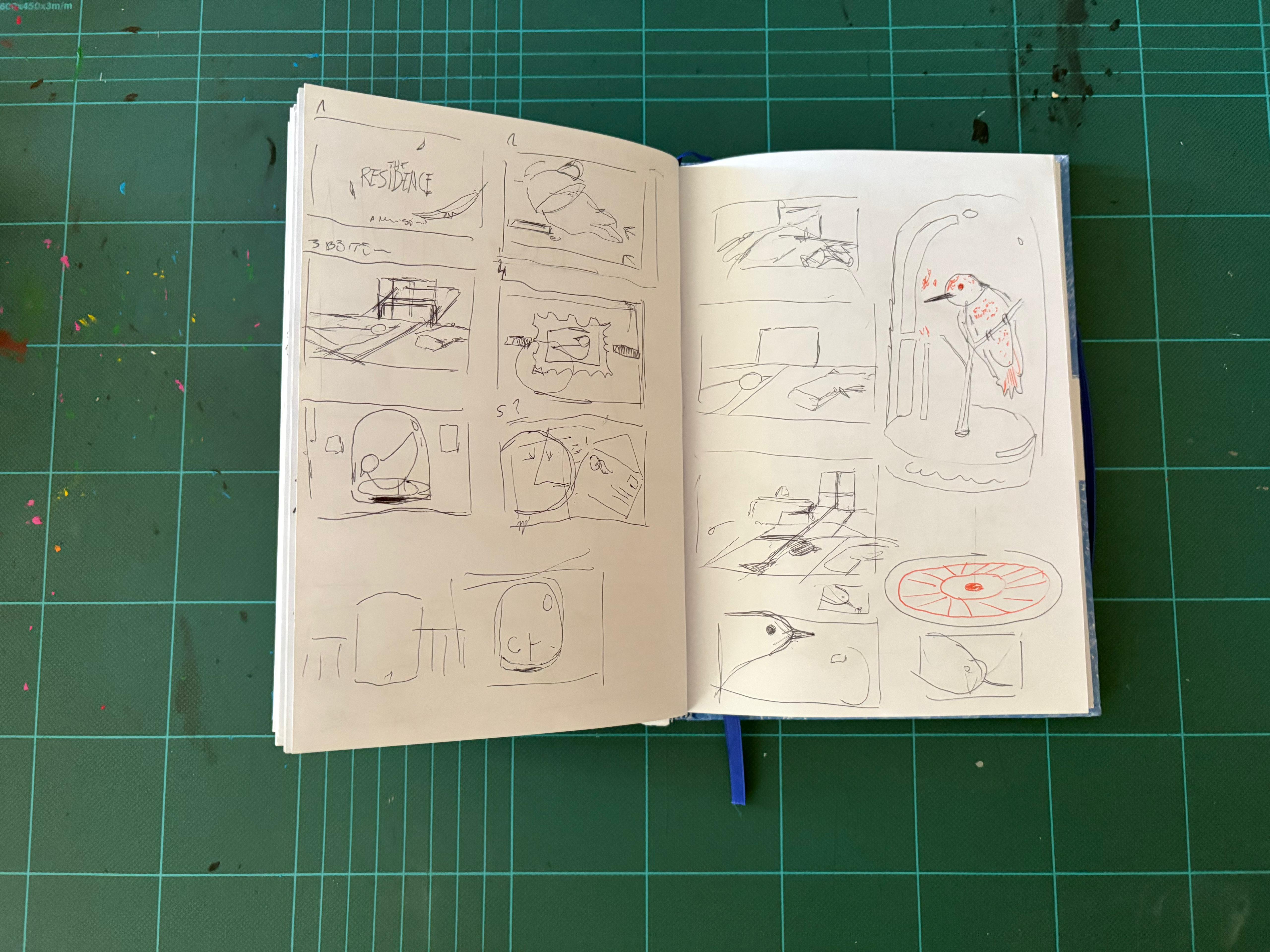
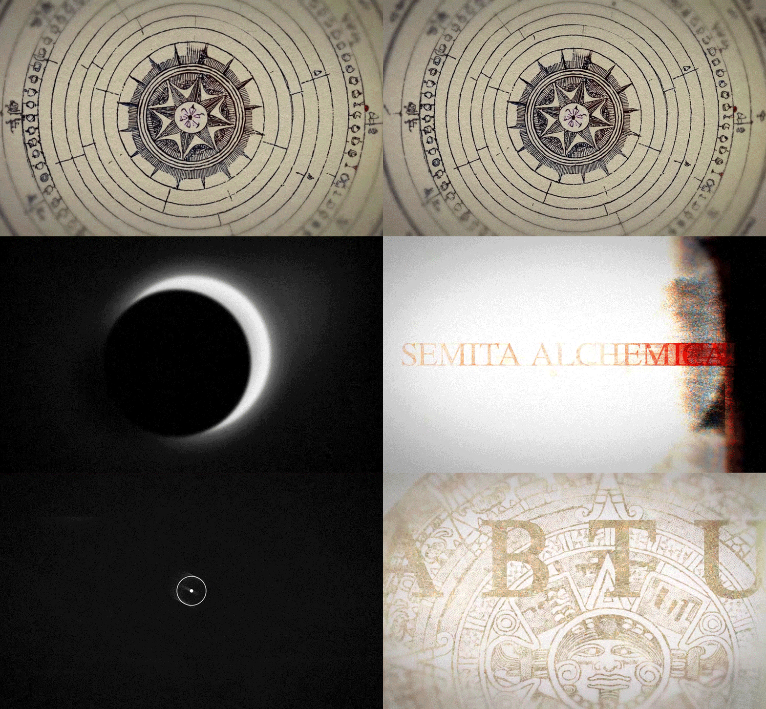
The brief was to create the intro titles for a series; We had specific keywords, a list of objects we could represent and a general mood idea, but the narrative approach and visual style were open. For me the idea was to create a brief visual introduction to what the series would be: A detective obsession, hidden clues, a possible weapon, basically showing details and situations aimed to amplify the settings of the series and at the same time without revealing any important information that would compromise the plot. My approach was more on the surreal side focusing on closeups and details, I wanted to represent some “interrupted” moments eliminating any human presence but hinting the passage of “something” or better someone.
Here the styleframes become a mini narrative aimed to spark curiosity, catch the attention and set the stage for what awaits the viewer.


Example 3 • Birds & Shells Short film
Aligning on the same objective: Styleframes for direction
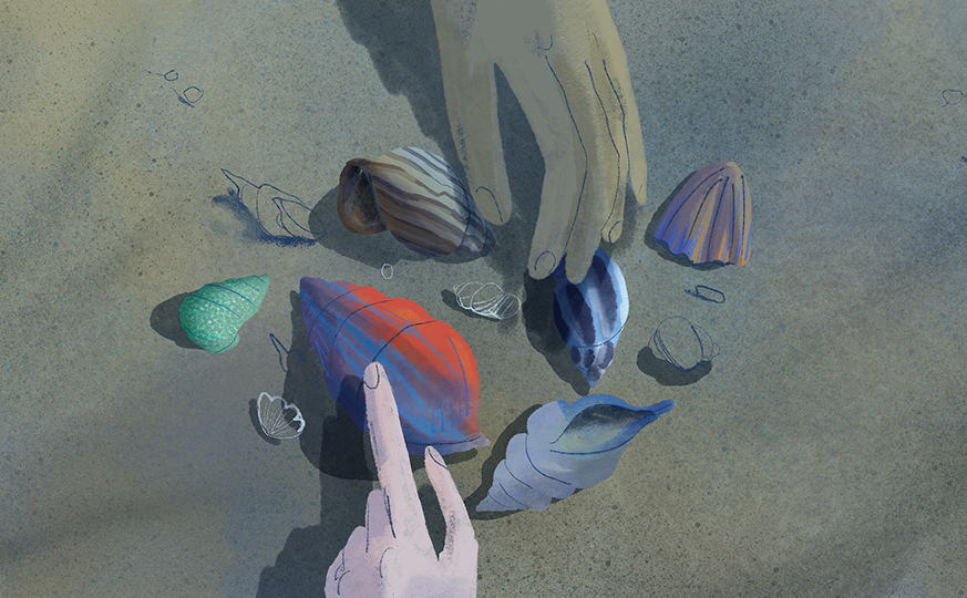
We may think that Styleframes are useful just in client relationships or commercially oriented projects, but the truth is that Styleframes are also an exceptional tool for giving better guidance and aligning a whole team on a common vision.
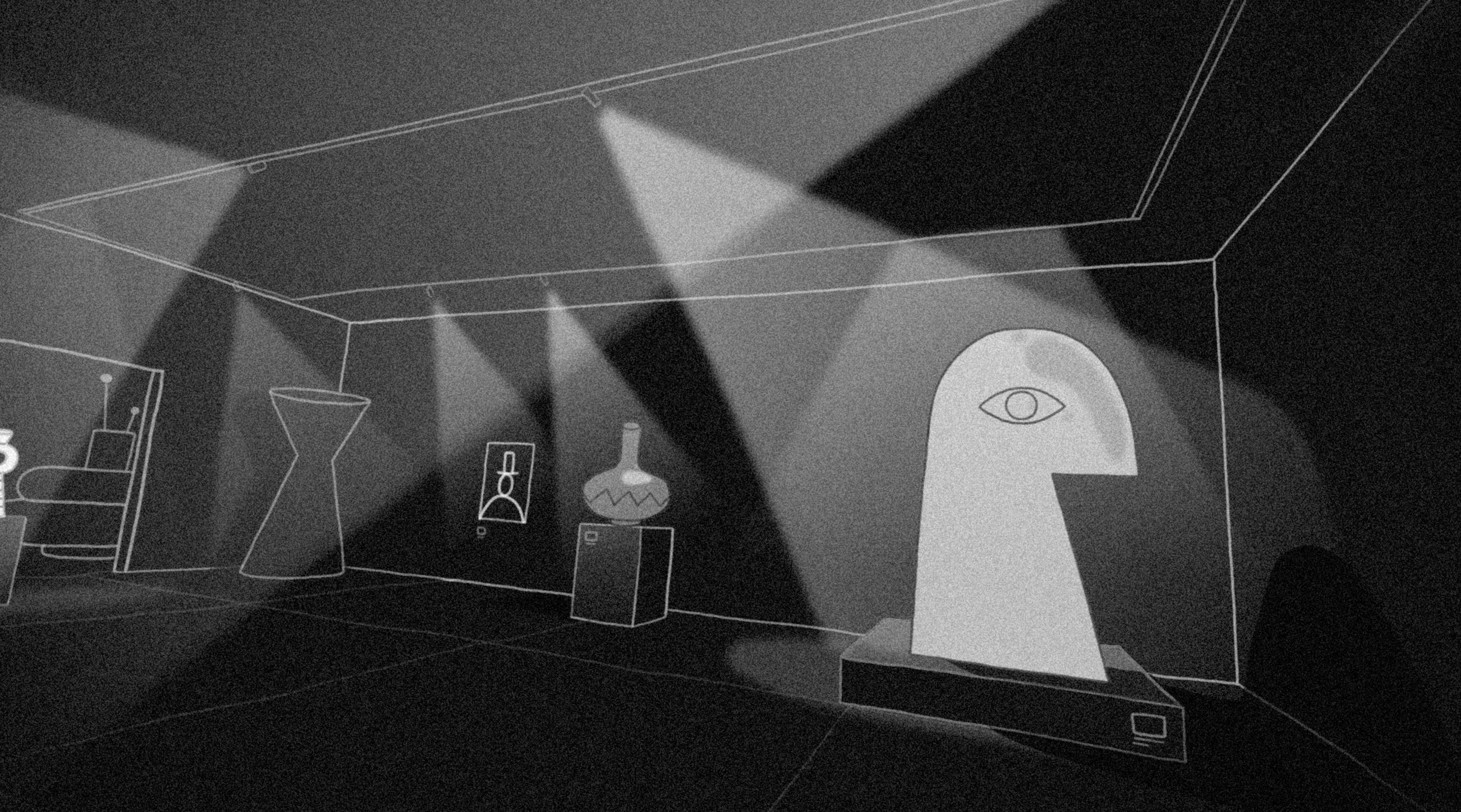
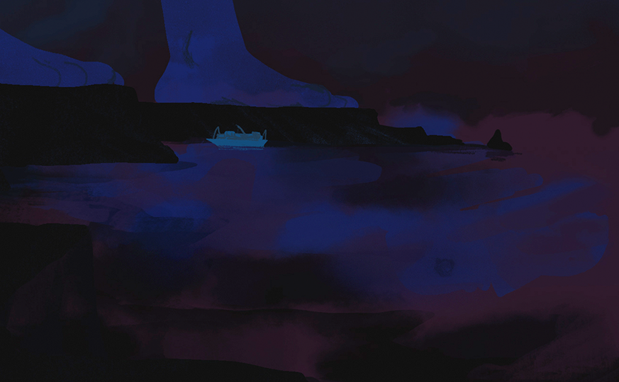
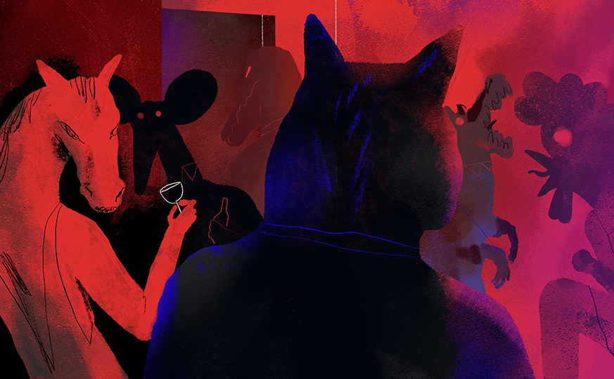
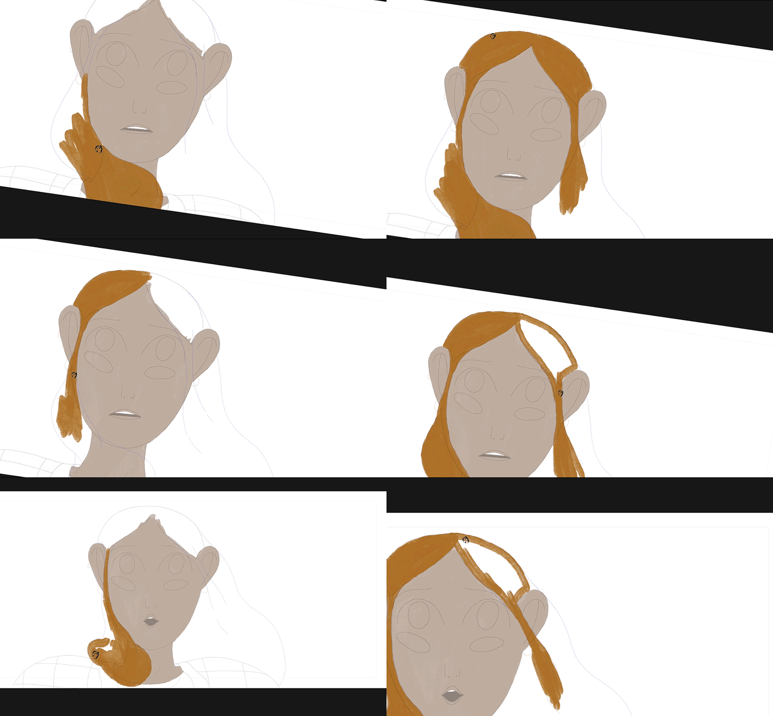
In this set created for the short film “Birds & Shells”, the boards are meant to pre-visualise the entire short before entering production but mostly to align different coproductions and teams towards the same direction;
Can the overall look change during production? Yes! But these frames serve as a starting point to set the right mood for the story, to understand how we differentiate past and present, to align on how much graphic detail we will need during the painting process, overall to speak the same language and look toward the same objective.
Everyone in the team can access and read them, and everyone, storyboard artist, animators, painters, producers, 3d artists will know exactly how we envision X, Y and Z, leaving almost no margin for misunderstandings.
Styleframes here become something more than static images: They bring all teams together, like a map, towards a common objective.


Example 04 • Nerdo X Luxottica
Designing for multiple audiences: Accessible visuals
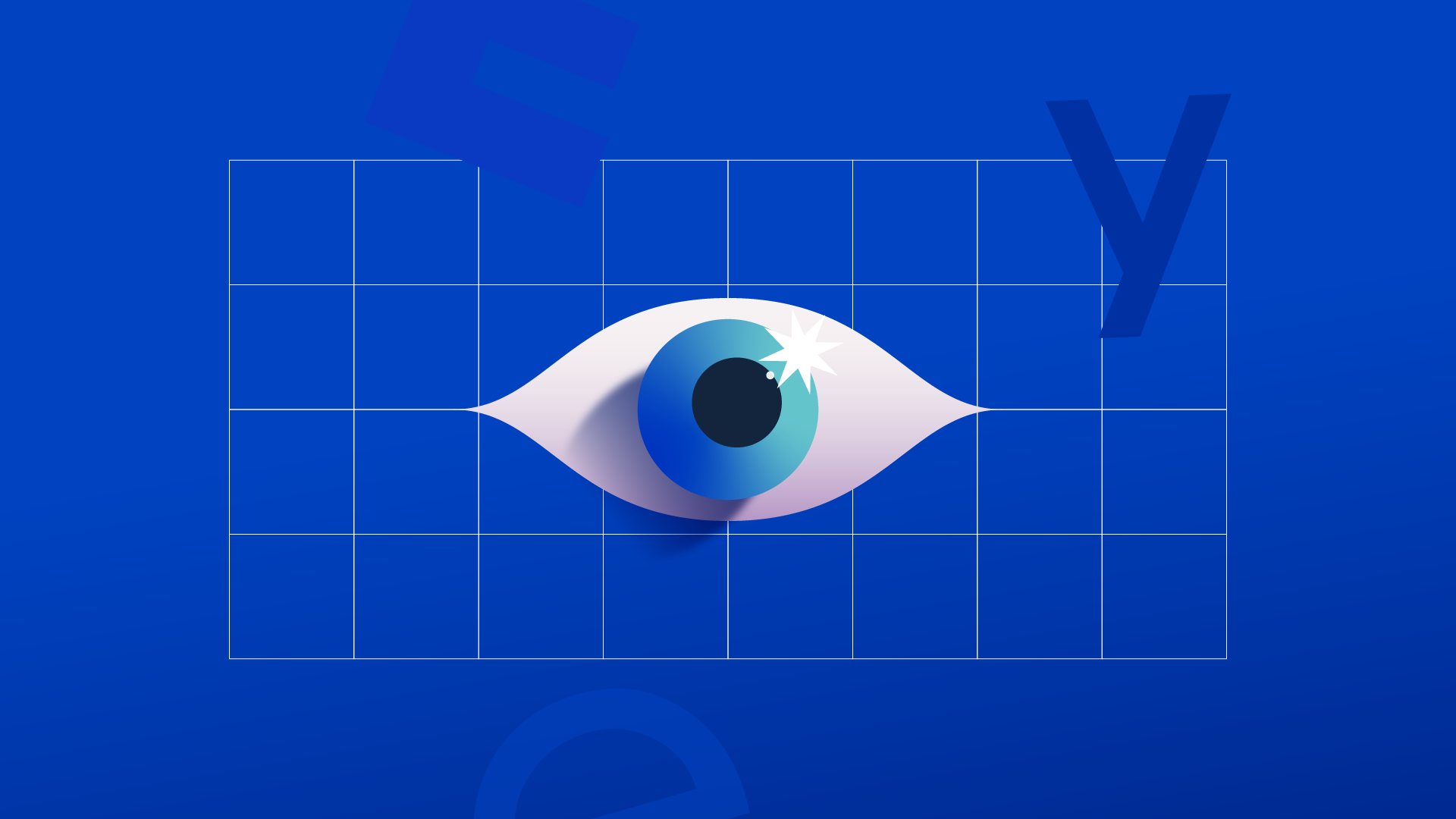
In this project, created for Nerdo, Styleframes are meant to make things more accessible. Let me explain; Some medical videos or more technical ones may have as primary audience a wide segment of the population with different backgrounds, ages, jobs, and making a product accessible to everyone is fundamental.
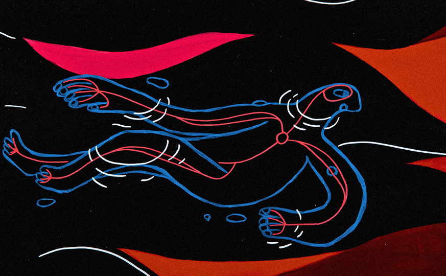
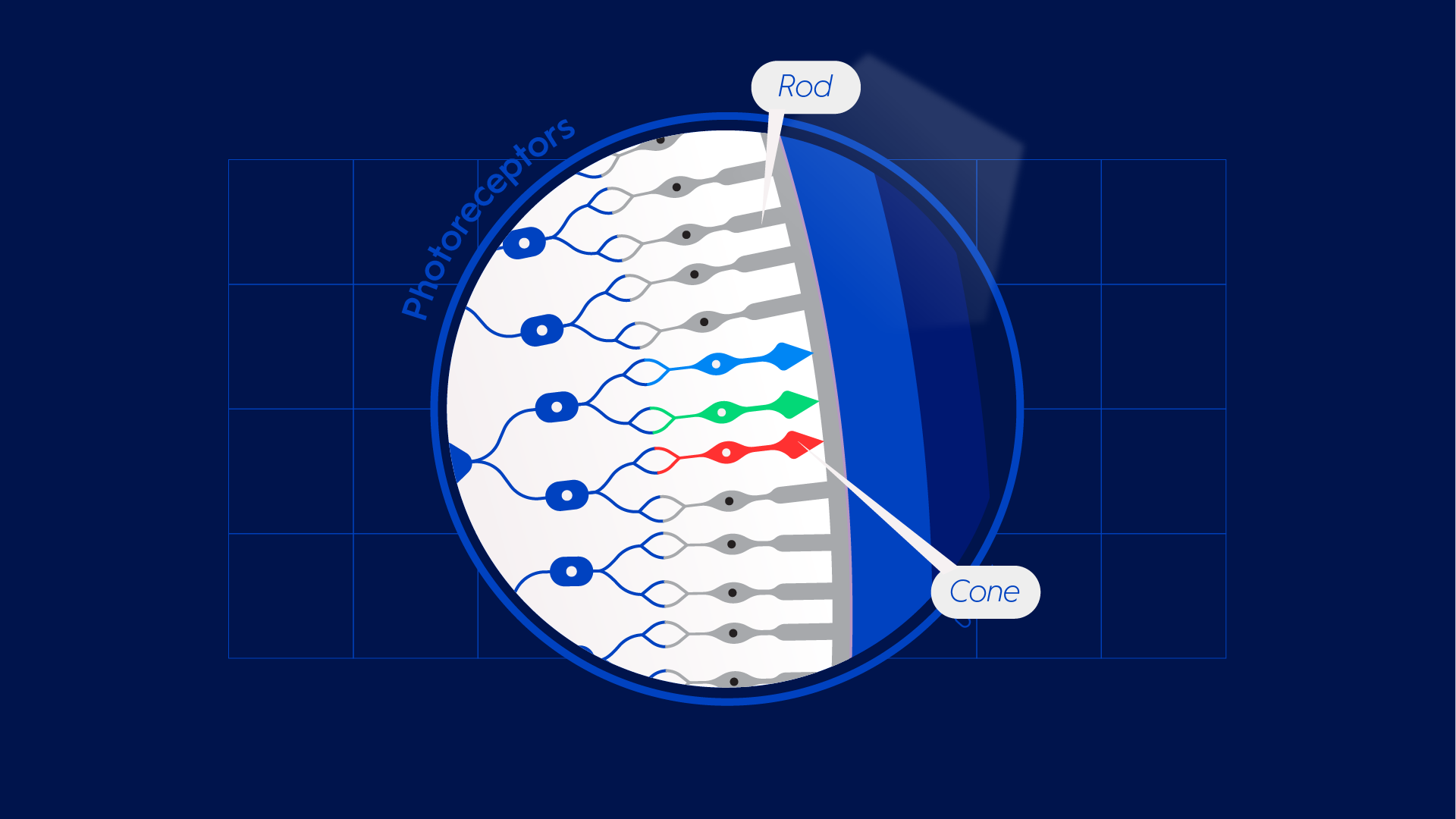
In this particular project I had to explore the function of the eye and how we perceive and interpret images, something that if we would have represented in a too scientific or medical way wouldn’t have engaged properly with the client audience, resulting in something too technical, anatomic and explanatory.
My idea was to refresh the approach to medical illustrations keeping the key moments more realistic but simplifying and creating a more agile visual language for the rest. This led me to create a colourful 2D oriented style that worked well in animation, was easy to understand and still accurate enough to support the video’s more technical content.


To sum it up, creating boards it is not about style, it is about thinking.
It is about understanding, interpreting and translating messages into clear impactful visuals able to set the base for successful production.
If you want to see more Styleframes and Art Directions projects you can check the Stills section of my website, you will be able to check projects developed for different clients in completelly different styles.


Want to see more?
STYLEFRAMES & ART DIRECTION
Newgold Stills

Full Credits
All the boards on this page have been developed by me, while the boards in Example 03 have been drawn by Massimiliano Di Lauro under my direction during the development of the short film Birds & Shells. The Example 01 has been developed for Partizan and Moving Colours and client Spotify. Example 02 was created for a pitch developed for Sarofsky studio and client Netflix. Example 03 is an animated short film written and directed by me and produced by BAP studio, while Example 04 was created for Nerdo and client Luxottica.

